Hi,
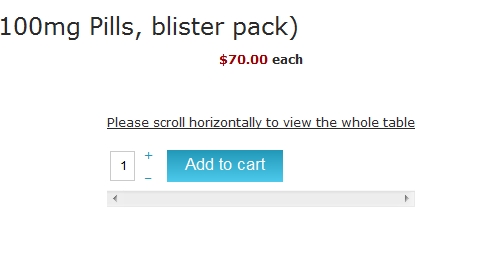
It is not something which is done by HikaShop but by your template.
There is two special CSS rules in responsive mode which are:
    table:before {
        content: "Please scroll horizontally to view the whole table";
        display: block;
        margin-bottom: 10px;
        width: 100%;
        text-decoration: underline;
    }
    table {
        position: relative;
        width: auto;
        overflow-x:scroll;
        display: block;
    }
These rules add the horizontal scrollbar and the text in the table.
Because the HikaShop "add to cart" is made with a table (in order to have the "-" and "+" aligned), your responsive CSS file make this unwanted display.
Regards,
 HIKASHOP ESSENTIAL 60€The basic version. With the main features for a little shop.
 HIKAMARKETAdd-on Create a multivendor platform. Enable many vendors on your website.
 HIKASERIALAdd-on Sale e-tickets, vouchers, gift certificates, serial numbers and more!
 MARKETPLACEPlugins, modules and other kinds of integrations for HikaShop


