Hello,
First of all may I say what a wonderful shopping cart you have developed!! 
I am having a small problem with the PopUp on checkout which I cannot seem to get around.
The problem is that it takes the body width from the main website:
/* Grid Container */
.rt-container {margin: 0 auto;width: 960px;}
body {min-width: 960px;}
So the buttons are too far apart.
I thought about adding the same for Hikashop:
.hikashop_notice_box_content {margin: 0 auto;width: 440px;}
Which will result in the content of this popup being closer together but the page itself is still 960px. There seems to be no way for me to be able to override the body, or at least not that I can find.
Any suggestions?
Your help is much appreciated.
Paul
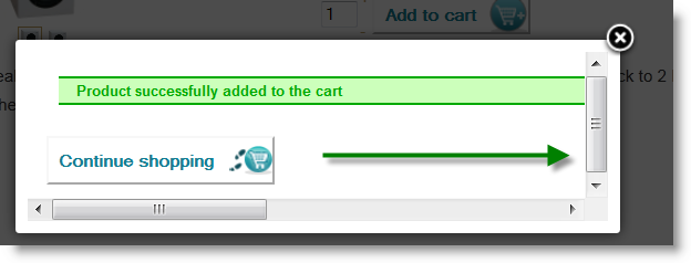
Screenshot Popup 1: As is originally
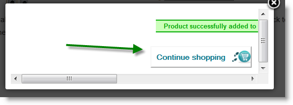
Screenshot Popup 2: With added CSS .hikashop_notice_box_content {margin: 0 auto;width: 440px;}
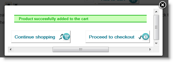
Screenshot Popup 3: Showing buttons together now but in center of 960px page
 HIKASHOP ESSENTIAL 60€The basic version. With the main features for a little shop.
 HIKAMARKETAdd-on Create a multivendor platform. Enable many vendors on your website.
 HIKASERIALAdd-on Sale e-tickets, vouchers, gift certificates, serial numbers and more!
 MARKETPLACEPlugins, modules and other kinds of integrations for HikaShop


