Hi,
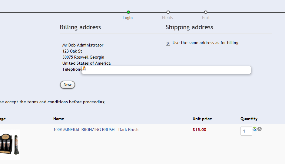
This problem is a template CSS problem.
The "edit" button has the class "modal" (like explain here:
www.hikashop.com/en/forum/4-how-to/77125...-hover-js.html#84203
)
You should add a specific css rule for this button in order to remove the modal popup rules which should not be applied on a "a" but on a "div".
Regards,
Jerome - Obsidev.com
HikaMarket & HikaSerial developer / HikaShop core dev team.
Also helping the HikaShop support team when having some time or couldn't sleep.
By the way, do not send me private message, use the "contact us" form instead.
 HIKASHOP ESSENTIAL 60€The basic version. With the main features for a little shop.
 HIKAMARKETAdd-on Create a multivendor platform. Enable many vendors on your website.
 HIKASERIALAdd-on Sale e-tickets, vouchers, gift certificates, serial numbers and more!
 MARKETPLACEPlugins, modules and other kinds of integrations for HikaShop


