Finalise Order confusion and suggestion

  • Posts: 218
  • Thank you received: 6
12 years 9 months ago #37316

1. I just realised then when putting through an order that there is no button to say "checkout" or "finalise order". the only button is "next" which is quite confusing. How does the customer know that the "next" button finalises the order? There should be a large checkout button that says "Finalise Order" or "Confirm Order" or "Place Order" and it should have a coloured background (eg Green).

for example:


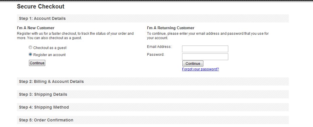
2. Also second suggestion, i think that the checkout page should be a one page checkout but have an accordion like effect (with say mootools) that is used in opencart and big-commerce and many other ecommerce systems. That way the customer knows the steps involved to order.

like this image:


or if not the accordion thing, maybe just some better styling so you can group each step as separate (like a grey border around each part address, shipping, payment, order etc)

Attachments:
Last edit: 12 years 9 months ago by woonydanny.

Please Log in or Create an account to join the conversation.

  • Posts: 82863
  • Thank you received: 13372
  • MODERATOR
12 years 9 months ago #37455

1. That's indeed a good idea but not easy to do as it depends on how you configure your checkout.
Since everything is dynamic for the checkout it gets quite complicated to know that just to display a different button.
You could do that yourself for your own configuration with a small modification of one of the view though:
www.hikashop.com/en/support/forum/4-how-...bel-next-button.html

2. There are already fieldsets around the views of the checkout. You should see them unless your template styling doesn't have borders for fieldsets.
I don't think that accordions are a good idea. Some users wouldn't understand that they need to click on the title to go to the next view.

Please Log in or Create an account to join the conversation.

  • Posts: 218
  • Thank you received: 6
12 years 9 months ago #37458

nicolas wrote: 2. There are already fieldsets around the views of the checkout. You should see them unless your template styling doesn't have borders for fieldsets.
I don't think that accordions are a good idea. Some users wouldn't understand that they need to click on the title to go to the next view.


Just had another look and there are some horizontal lines to break up different areas but it still looks a little 'jumbled' and not as clear as it could be. Anyway just a suggestion :P

Please Log in or Create an account to join the conversation.

  • Posts: 218
  • Thank you received: 6
12 years 9 months ago #37459

nicolas wrote: 1. You could do that yourself for your own configuration with a small modification of one of the view though:
www.hikashop.com/en/support/forum/4-how-...bel-next-button.html


i think there is an issue with some links as ive seen it a bit where a link on the forum here takes us to a french forum message title 'BRAVO'
www.hikashop.com/en/forum/5-support-en-f...ort-/2-bravo-.html#4

i can't actually navigate to the link you provided :(

Please Log in or Create an account to join the conversation.

  • Posts: 82863
  • Thank you received: 13372
  • MODERATOR
12 years 9 months ago #37552

Ah yes, use this link instead:
www.hikashop.com/en/forum/4-how-to/9242-...ext-button.html#9242

The new version of kunena use different links and thus the old links do not work anymore...

Please Log in or Create an account to join the conversation.

  • Posts: 218
  • Thank you received: 6
12 years 9 months ago #37628

I overrided the language string

HIKA_NEXT="Next"

to

HIKA_NEXT="Confirm Order"

and that seemed to do what i wanted

Please Log in or Create an account to join the conversation.

Time to create page: 0.073 seconds
Powered by Kunena Forum