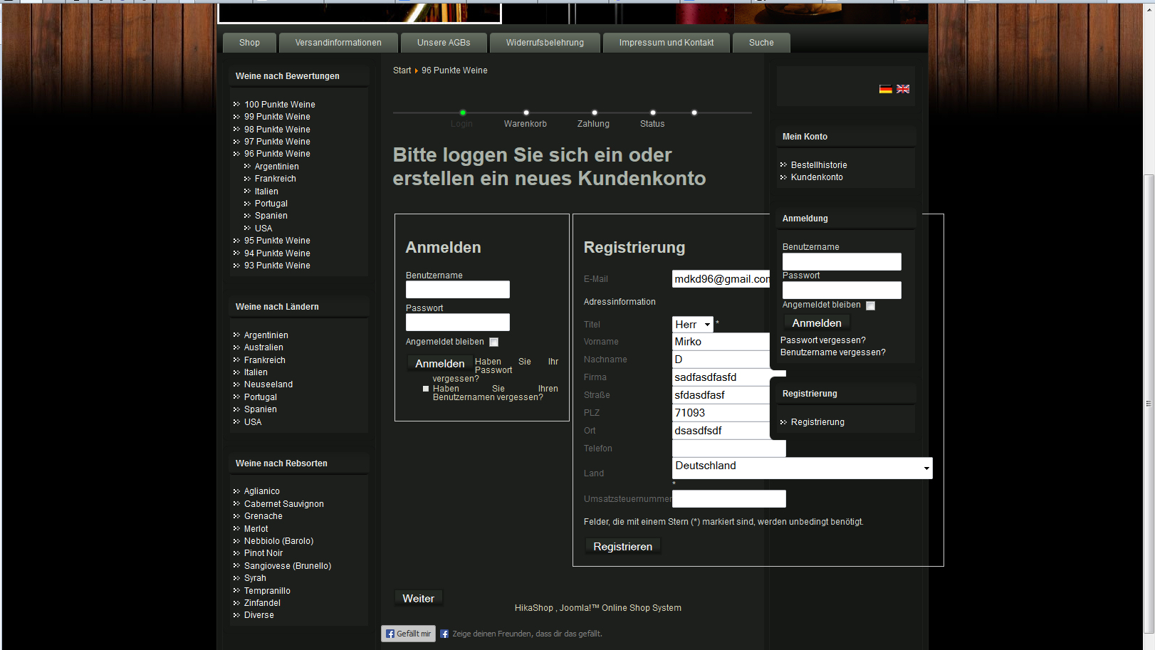
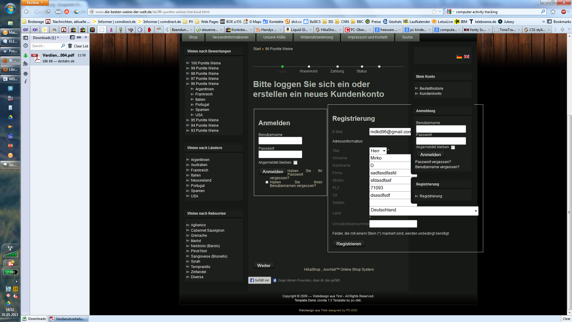
got it... your user documentation is wrong... instead of removing the float:left from .hikashop_checkout_login_right_part, it must be removed from .hikashop_checkout_login_left_part
you have a job opening for a tester I can apply  ?
?
Joke aside... as you see on the screenshot: on the smaller log-in panel, there is a list of two options, asking for forgot PW or forgot UserID. Somehow my style sheet tries to place a fat square bullet in front of both list entries, and starts with the text right next to the log-in button... it looks just awful. Can you point me to the place, where I can remove the bullets and move the text below the button?
Thanks a lot!
 HIKASHOP ESSENTIAL 60€The basic version. With the main features for a little shop.
 HIKAMARKETAdd-on Create a multivendor platform. Enable many vendors on your website.
 HIKASERIALAdd-on Sale e-tickets, vouchers, gift certificates, serial numbers and more!
 MARKETPLACEPlugins, modules and other kinds of integrations for HikaShop


