Displaying Related Products on Product Pages

  • Posts: 13
  • Thank you received: 0
11 years 4 months ago #114389

Hello,

So take a look at this page: 174.132.115.188/~paulagot/index.php/stor...17-apple-valley-barn

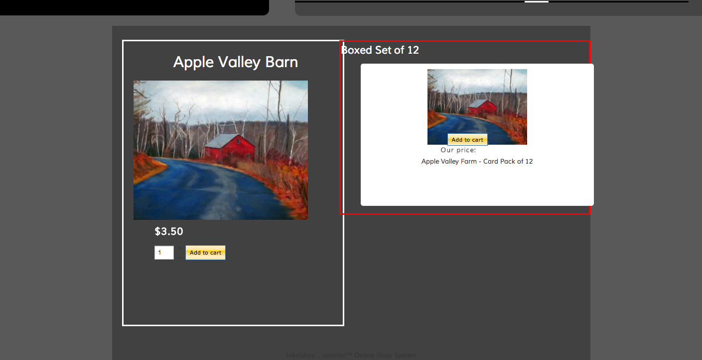
Please pay no attention to the styling; or very little attention anyway. What I have here is a product page for the Apple Valley Barn card where you can buy one or more individual card for $3.50 as represented in the white square on the left. On the right I have a related product. I created a custom module for it and learned how to make it display on the product page to which it is related. All good so far. Now if you click on the image in the related product which is a boxed set of 12 of the individual cards you get this page: 174.132.115.188/~paulagot/index.php/hika...farm-card-pack-of-12

What I want to get is that view; that box next to the box on the previous page that is on the left.

In the alternative can I turn off the counter and the navigation (1 of x) and add a quantity form field? I think I can figure out how to make the image look better.

Please ask for clarification if necessary.

Thanks so much,

Luciano

Please Log in or Create an account to join the conversation.

  • Posts: 12953
  • Thank you received: 1778
11 years 4 months ago #114457

Hi,

luciano991 wrote: What I want to get is that view; that box next to the box on the previous page that is on the left.

In the alternative can I turn off the counter and the navigation (1 of x) and add a quantity form field? I think I can figure out how to make the image look better.


1. Can you give me more information on what you exactly want to do through some screenshots for example ?

2. In "Hikashop->System->Configuration->Dysplay", you have the option called Pagination that you can set to "no".

The following user(s) said Thank You: luciano991

Please Log in or Create an account to join the conversation.

  • Posts: 13
  • Thank you received: 0
11 years 4 months ago #114744


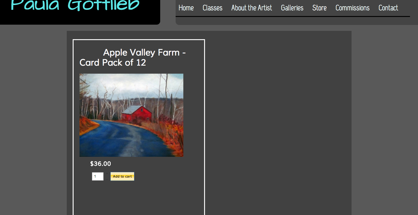
OK, there are two screenshots here. The first, Apple Valley Farm, has a white boxed content and a red boxed content. I want the white boxed content exactly as is. The second is Apple Valley Farm Card Pack of 12. I want that content in the white square to appear next to the white square in the first screen shot in place of the red bordered content. So she sells a card called Apple Valley Farm. You can buy one or more for $3.50 each. Or you can buy 12 for $36.

Thanks,

Mark

Attachments:
Last edit: 11 years 4 months ago by luciano991.

Please Log in or Create an account to join the conversation.

  • Posts: 82863
  • Thank you received: 13372
  • MODERATOR
11 years 4 months ago #114945

If I understand correctly, what you want to do is to add the Apple valley farm product as a related product of the pack of 12 so that when you go to the pack of 12 page, you get the apple valley farm product on the right of the screen.

Please Log in or Create an account to join the conversation.

  • Posts: 13
  • Thank you received: 0
11 years 4 months ago #115069

Actually it's the opposite. There will be a product listing page by category. You click on one of the products you go to the product page. So Apple Valley Farm is a card that will be listed on the product listing by category page. The user clicks on it and goes to the product page where he/she can purchase one or more copies of the Apple Valley Farm card at $3,50 apiece. But right next to that I want to show the 12-pack in case they want to buy that and save some money.

Thanks,

Mark

Please Log in or Create an account to join the conversation.

  • Posts: 2334
  • Thank you received: 403
11 years 3 months ago #115279

Now that understood what you want, could you tell us more about the issue?
If you don't know how to display the related product, you just have to publish the right module in Display>content module.
If you want to attach a related product to the main one, you'll find in the production configuration page (in the backend). Do not hesitate to click on the help button for more information.
Finally, if your issue is just about css and display, tell us what exactly you imagine and we'll help you moving the box where you want :).

Please Log in or Create an account to join the conversation.

  • Posts: 13
  • Thank you received: 0
11 years 3 months ago #115326

OK, so first of all, thanks for being attentive to my issue. It is a refreshing change from most technical support.

Now on this issue, I think I was over thinking. So now, if you go to this page: 174.132.115.188/~paulagot/index.php/store/cards-barns

You will see a page that displays products in a certain category. CSS wise the width is too narrow for these items. Secondly, clicking on the Add to Cart button does nothing. Third I need to change the font color on the Add to Cart button.

Now when you click on an image on that page you get this: 174.132.115.188/~paulagot/index.php/stor...17-apple-valley-barn

This is exactly what I want, with the related product of the box of 12 sitting to the right of the main product. Issues are:

I need a quantity form box on both items.
I need to style the quantity box, the price and the Add to cart so they appear below the image.
There is a description that is not appearing.

I think if I get that done I'll be mostly done.

Any help you can offer would be appreciated.

All the best,

Mark

Please Log in or Create an account to join the conversation.

  • Posts: 2334
  • Thank you received: 403
11 years 3 months ago #115409

Hi Mark,

About the css, you have this rule applied on your boxes:

div.hikashop_subcontainer.hikashop_subcontainer_border { 
background: transparent !important;
width: 55%;
}

just change the width to 100% and it will be better ;)
About the add to cart button, it's working but since you don't have any visible cart or checkout you can't see that the product is added to the cart.
Just enable the mini cart or set a menu to the checkout and you'll see the product added to the cart.

About the product page, I think you have to edit the related product module (if it's what you are using). The id of the module you have to edit is 222.
About the quantity box, it's all about css, just look at our documentation to know more about it: www.hikashop.com/en/support/documentation/faq.html#css
Finally for the description, I think you edited your view and have hidden it. Please check your views in Display>Views for show/product

The following user(s) said Thank You: luciano991

Please Log in or Create an account to join the conversation.

  • Posts: 13
  • Thank you received: 0
11 years 3 months ago #115571

OK,

So you were a very big help, thanks. But...

This div.hikashop_subcontainer.hikashop_subcontainer_border is giving me trouble.

So what I did was I essentially commented out all my custom styles in my template's custom style sheets. I added these styles to the frontend custom stylesheet.

span.hikashop_product_price{
color:#fff;
white-space:nowrap;
font-size: 2em;
line-height: 2.5em;
}


.hikashop_product_stock table {
margin-top: -50px ;
}


So that's all I did. Now the product display on this page: 174.132.115.188/~paulagot/index.php/stor...17-apple-valley-barn is fine. But the related product display is too large. Now I think that's related to the display problem I'm having here: 174.132.115.188/~paulagot/index.php/store/cards-barns

Now let me guess; is my problem with # of columns. I have looked everywhere and set columns to 3 but I can't seem to find the right setting.

Again, your help has been above and beyond the call of duty so thanks so much.

All the best,

Mark

Please Log in or Create an account to join the conversation.

  • Posts: 2334
  • Thank you received: 403
11 years 3 months ago #115640

You're welcome ;)
About the display, I think it's indeed related to the number of columns, for the second link, check your menu with the id 335, and change the number of columns to 3.
For the related product, check the module with the id 222 (related) and change the number of column as well. Also, note that you can change in the module/menu configuration page the size of the product images :)

Please Log in or Create an account to join the conversation.

  • Posts: 13
  • Thank you received: 0
11 years 3 months ago #115744

Thank you so much. I finally have it resolved. It's not perfect but it's close enough. I can't thank you enough for helping me resolve this issue. I think I got in trouble when I decided to alter some layouts with some custom CSS. Eventually I had to use some CSS to get this resolved but that was my fault. I look forward to future versions where picking different layouts for product pages will be a bit easier. I still need to go back to the beginning and try learning this software from step 1. But I think it's going to work great for my client.

All the best,

Mark

Please Log in or Create an account to join the conversation.

Time to create page: 0.077 seconds
Powered by Kunena Forum