Reporting styling inconsistencies

  • Posts: 42
  • Thank you received: 2
7 years 9 months ago #263208

-- HikaShop version -- : 3.0.0
-- Joomla version -- : 3.6.5
-- Browser(s) name and version -- : Various

Good day,
Just wondering if there is a central location or a preferred method for communicating styling inconsistencies within Hikashop? Most I come across are minor, but they are noticeable and do detract from the overall shopping experience. A quick example: Leaving all other configuration options the same, changing 'Configuration->Display->Product Options->Add to cart on listings' between "One Per Product" and "Global" results in differently styled Add To Cart buttons. Would you like these reported individually, or would you prefer a daily/weekly compiled list? Bug report, feature request, or other location/method?

Thanks,
Matt


It's amazing how the omission of a semicolon can absolutely ruin an otherwise pleasant evening.

Please Log in or Create an account to join the conversation.

  • Posts: 82863
  • Thank you received: 13372
  • MODERATOR
7 years 9 months ago #263214

Hi,

It would be better to have individually reported problems so that one person can deal with one problem at a time on our end.

Regarding the add to cart buttons, I actually don't see the problem :
monosnap.com/file/viwye8XrmhCeob5DFUPoyRbI6DD6TZ
monosnap.com/file/fZBOPqBhjdSEyxmrbI9dyEPFc6rTZR
It might be linked to your template CSS, or only happen in some specific case.
So we'll need more information to look at that, like a link to the page with the issue, and screenshots of before/after.

The following user(s) said Thank You: فیض آبادی فراهانی

Please Log in or Create an account to join the conversation.

  • Posts: 42
  • Thank you received: 2
7 years 9 months ago #263320

Hi Nicolas,
Thanks for the reply. You can actually see what's happening with the add to cart button in one of my earlier screenshots related to the stock level display (attached).

Matt


It's amazing how the omission of a semicolon can absolutely ruin an otherwise pleasant evening.
Attachments:
Last edit: 7 years 9 months ago by spoonbow. Reason: Updated information

Please Log in or Create an account to join the conversation.

  • Posts: 26158
  • Thank you received: 4028
  • MODERATOR
7 years 8 months ago #263326

Hi,

I'm afraid that it does not explain your issue and the "styling inconsistency" that you're talking about.

www.hikashop.com/support/documentation/1...the-display.html#css

Regards,


Jerome - Obsidev.com
HikaMarket & HikaSerial developer / HikaShop core dev team.

Also helping the HikaShop support team when having some time or couldn't sleep.
By the way, do not send me private message, use the "contact us" form instead.

Please Log in or Create an account to join the conversation.

  • Posts: 42
  • Thank you received: 2
7 years 8 months ago #263397

Jerome,
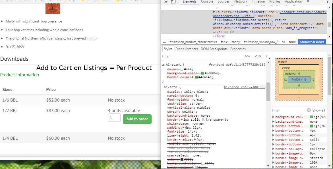
Sorry for the confusion. In response to my initial post, Nicolas kindly provided an example site where this behavior is not seen, and suggested that it may have something to do with the site-wide template that I'm using. He requested additional information including a before/after screenshot. I used a screenshot from an earlier thread with Nicolas because it was handy. I did not take into account that others would be viewing this thread and that they would not have the reference frame of our earlier discussion. So, please ignore the yellow circles, and instead focus on the Add to Cart buttons in the side-by-side image. On the left is the view configured for Global add to cart. On the right, configured for one per item. The only configuration change is the add to cart button display method, yet it results in completely different styles for the Add to Cart button on my site. That is the inconsistency that I referred to. I am fully aware that this appears to be an issue exclusive to some element of my particular site, and that the designers at Hikashop can not design for every possible variation and configuration of Joomla website. I'm looking for guidance on how I may resolve this issue, and any information you might be able to provide to help me fix the issue would be most appreciated.

Matt


It's amazing how the omission of a semicolon can absolutely ruin an otherwise pleasant evening.

Please Log in or Create an account to join the conversation.

  • Posts: 200
  • Thank you received: 75
7 years 8 months ago #263410

Hi,

did you check the link Jerome gave in his post?
Reading the article carefully should help you out, since your problem looks to be a CSS issue.

By changing the add to cart setting from "One per listing" to "Global" nothing changes to the Add to Cart button itself, only its position on the page changes. So you should check your CSS styles being applied on the button in both cases. For example, your green button style might only be applied when it is inside the Sizes table, but not outside of it.

Hope that helps.

Please Log in or Create an account to join the conversation.

  • Posts: 42
  • Thank you received: 2
7 years 8 months ago #263434

Hey GW,
Thanks for helping out! I guess my question relates mainly to a point that you bring up in your post.

By changing the add to cart setting from "One per listing" to "Global" nothing changes to the Add to Cart button itself, only its position on the page changes.


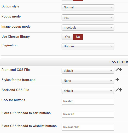
That is the assumption that I am working under, but I'm not seeing it reflected in practice on my site. I'm trying to understand why it is that when no other configuration option changes save for where the button is being displayed (add to cart listings), the appearance of the button changes. If I set the Configuration->Display->General Display Options->Button Style to "Normal", then I would expect any buttons that are displayed to be styled using my site template. This is indeed the case as long as the Configuration->Display->Product Options->Add to cart on listings option is set to global. Once the configuration is set to "one per product" the button is then rendered using the settings specified in Configuration->Display->CSS Options. A third style is seen by changing the "Button Type" to CSS, which causes the add to cart button to display as plain text in the Global add to cart mode.

Perhaps the attached graphic will explain better than I can.

Matt


It's amazing how the omission of a semicolon can absolutely ruin an otherwise pleasant evening.
Attachments:
Last edit: 7 years 8 months ago by spoonbow.

Please Log in or Create an account to join the conversation.

  • Posts: 200
  • Thank you received: 75
7 years 8 months ago #263438

Hi Matt,

these are just problems with your template and my previous answer still stands, you need to check your CSS styles and make some adjustments. Otherwise best take it up with your template designer, because your template doesn't appear to be made yet for Hikashop 3.

You would indeed expect the buttons to be styled the same everywhere on the page, but the fact they do not indicates your template has not been designed to take that into account.

Please Log in or Create an account to join the conversation.

  • Posts: 42
  • Thank you received: 2
7 years 8 months ago #263449

OK, bear with me here. I understand what you are saying, but in this instance, it is not a matter of the template I am using overriding Hikashop and causing undesired results. From what I can tell, Hikashop is not consistently applying classes/styles or even element types to the Add to Cart button based on configuration options chosen.

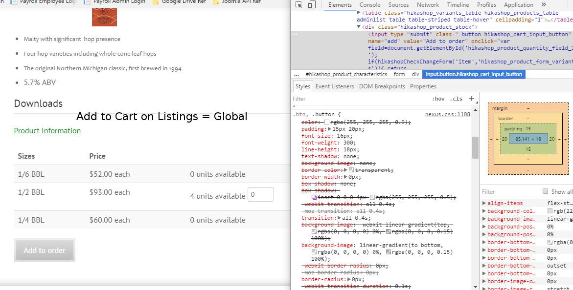
For instance, when the configuration is set with Button Type set to Normal, (where I would expect my site template to take precedence) and Add To Cart On Listings is set to Global the expected behavior occurs and the Add to Cart button is displayed as #1 above, that is, rendered using the style from my template. The button is rendered as an input element with a class=" button hikashop_cart_input_button" and all applied styles are a result of the 'button' class in bootstrap.css or nexus.css, both of which are associated with my template. Switching from a Global to a Per Product configuration for the add to cart button, without changing any other configuration, results in the button being rendered as a hyperlink (a) element with a class="hikabtn hikacart", both classes being defined in one of two Hikashop css files depending on the Button Type configuration. As such, there is no call to any stylesheet other than those belonging to Hikashop, so there can be no reasonable expectation that an external, site-wide template would influence the display.

I guess I just don't understand why the drastic difference in code for the button between the Global and One Per Product configurations. Why not render the button the same way in each instance? I would understand if additional/differing classes were used for positioning purposes in the two different layouts, but why change the type of element entirely?

I'm not trying to be an ass. I'm simply reporting the behavior I am experiencing on my site and trying to understand why it is occurring. I'm operating under a number of assumptions, some of which may be erroneous, in which case I look forward to being corrected. My first assumption is that regardless of whether Hikashop is configured to rely on external CSS (Button Type Normal), or it's own CSS (Button Type CSS), it should use one or the other exclusively based on that configuration setting. I would further assume that the button would be rendered as the same type of element consistently, not changing between an input element and a hyperlink within the same Button Type configuration. The final assumption I'm working under is that while configuration is set to Button Type CSS, the same css rules related to general appearance of the Add to Cart button should be applied to that button (via the element's classes) regardless of its display position on the page. If these assumptions are incorrect, I apologize for my ignorance and would appreciate any clarification of the configuration options and their intended effects that the community might provide.

Matt

It's amazing how the omission of a semicolon can absolutely ruin an otherwise pleasant evening.
Attachments:

Please Log in or Create an account to join the conversation.

  • Posts: 200
  • Thank you received: 75
7 years 8 months ago #263452

Hi Matt,

you're not wrong, there are indeed some different classes going on because of new improvements in Hikashop 3, so I guess you could say we're in a transitional phase from Hikashop 2 to 3, that's why they still have the legacy settings. Hopefully someone of the Hikashop team would gladly discuss that with you, but instead of writing these long posts it's really a matter of a few minutes to fix it.

Why not simply add the old button class in your display configuration under "Extra CSS for add to cart buttons" and everything should look fine, easy fix. Or just open your template CSS file and add the new button class in a few places, a few minutes work at most. Just trying to help with a quick solution.

Kind regards,

Please Log in or Create an account to join the conversation.

  • Posts: 82863
  • Thank you received: 13372
  • MODERATOR
7 years 8 months ago #263402

Hi,

I agree with GW. The global add to cart button styling comes indeed from your template.
Now, why your template styles the add to cart button when it's global and not when there is one per product, I suppose that's because its CSS needs to be updated to support HikaShop 3 properly, like GW said.
But there might be a way to have it use the same CSS for both with a slight modification of its CSS.
Could you provide a link to the page with the styled add to cart button (global) so that we can look at the CSS of the template ?

Last edit: 7 years 8 months ago by nicolas.

Please Log in or Create an account to join the conversation.

  • Posts: 42
  • Thank you received: 2
7 years 8 months ago #263592

Nicolas and GW,
Thank you both for your consideration and input on this matter. I fear we have all spent too much time on what can admittedly be patched up with a workaround or two quickly and effectively. I am still puzzled as to why the Add To Cart button is rendered as a different element type based on configuration.

When the button type is set to "Default" and add to cart is configured as "Global" the button is rendered as an <Input> element:

<input type="submit" class=" button hikashop_cart_input_button" name="add" ...
When the button type is set to "Default" and add to cart is configured as "Per Product", the button is rendered as an <a> element:
<a class="hikabtn hikacart" href="/product-catalog/product/updatecart/add-1/cid-7" onclick= ...

My site-wide CSS defines style for the .button class, so in the absence of any overriding style the Add to Cart button accordingly. Once the configuration is changed to "Per Product", Hikashop renders as an <a> element, so the the button class styling no longer applies. That is why the button displays differently, correct?

Matt


It's amazing how the omission of a semicolon can absolutely ruin an otherwise pleasant evening.

Please Log in or Create an account to join the conversation.

  • Posts: 200
  • Thank you received: 75
7 years 8 months ago #263636

Hi Matt,

yes, it displays differently because in your template only the .button class is defined, which is present in the "old" input elements but by default not in the new Add to Cart <a> buttons.
As you can see, by default Hikashop 3 now uses the class .hikabtn for the buttons, which isn't defined in your template hence it's not styled by your template, but the great thing is HS 3 allows you to set the class for the buttons yourself as defined in the Display Configuration with CSS for buttons.

So like I indicated in my previous answer, you can:
1. Change this default hikabtn class to button in your configuration and your buttons should look exactly the same with any of your settings whether you have an <input> or <a> element
2. Or add the class .hikabtn in your template CSS file to where the class .button is also defined

Kind regards,

Last edit: 7 years 8 months ago by GW.
The following user(s) said Thank You: فیض آبادی فراهانی

Please Log in or Create an account to join the conversation.

  • Posts: 82863
  • Thank you received: 13372
  • MODERATOR
7 years 8 months ago #263604

Hi,

Before HikaShop 3, we used the "displayButton" function of the class helper.cart. That function allowed you to select how the buttons would display with the "button style" setting of the HikaShop configuration, and thus it could either be an input or an a link.
This created some complex technical situations for us and template developers had to provide custom CSS for both modes, increasing their work for no useful reason (and often they didn't, thus breaking the display of the buttons).
With HikaShop 3, we decided to stop doing that and started to have hard written "a" tags for the new add to cart system.
With the legacy one though, we're still using the displayButton function and thus you end it with input add to carts if "default" is selected.

On my end, with HikaShop 3, and with the add to cart legacy setting turned off, I see "a" tags with both global and per product settings. As that's not the case for you apparently, maybe your template has view overrides, or maybe you have an old build of HikaShop 3.

The following user(s) said Thank You: فیض آبادی فراهانی

Please Log in or Create an account to join the conversation.

Time to create page: 0.125 seconds
Powered by Kunena Forum