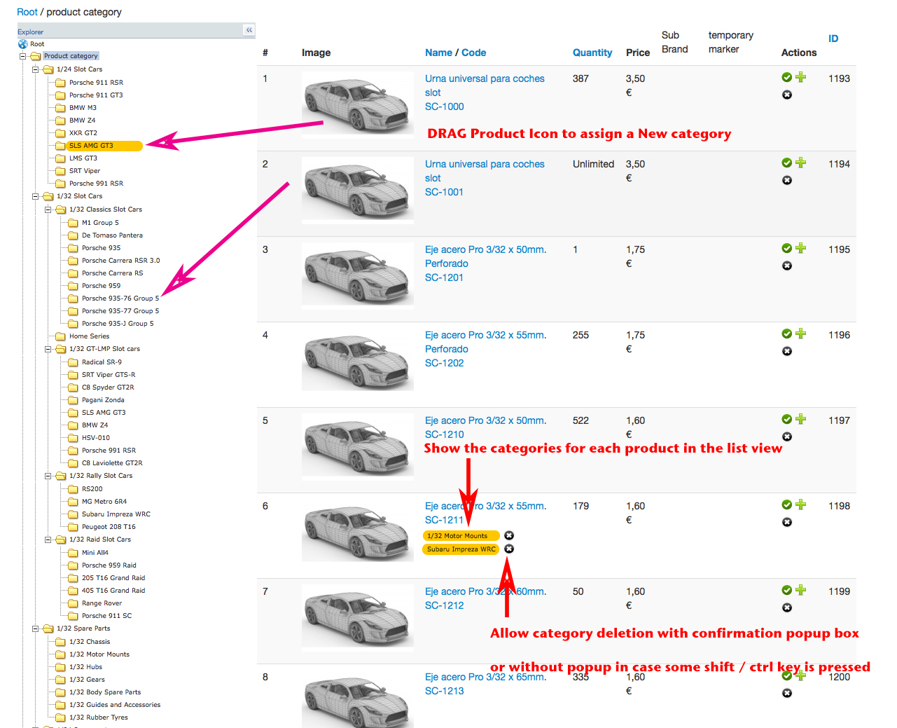
The inverse (drag a category from the tree to the product) is more logical to add a new category.
This sounds reasonable, just that dragging the product thumb makes visually simple to do it. But of course your concept makes more sense for the naive user. In any case it would be a giant step further to daily work efficiency.
About the display of the categories for each product, I have some reserved ; I'm not sure that it would be interesting for everyone and won't be useful if some product have a lot of categories.
I agree absolutely is not useful in all cases and I guess would be resource consuming in huge databases, so it would be good if it was a selectable function. In my humble opinion many people is not using or requesting this kind of feature simple because is not common in this kind of interfaces, but once you have it you can't live without it when is about huge catalogs.
About the "problem when too much categories are assigned to a product" it can be simply solved by showing only a limited number and letting display more in a popover box. I understand that adding the 'Delete button' adds both complexity in coding and more 'charge' in the browsing experience so maybe this part could be left for a later future.
Please let me know if you decide to put this feature in the ToDo list.
Thank you for your interest in my suggestions.
 HIKASHOP ESSENTIAL 60€The basic version. With the main features for a little shop.
 HIKAMARKETAdd-on Create a multivendor platform. Enable many vendors on your website.
 HIKASERIALAdd-on Sale e-tickets, vouchers, gift certificates, serial numbers and more!
 MARKETPLACEPlugins, modules and other kinds of integrations for HikaShop


