Hi,
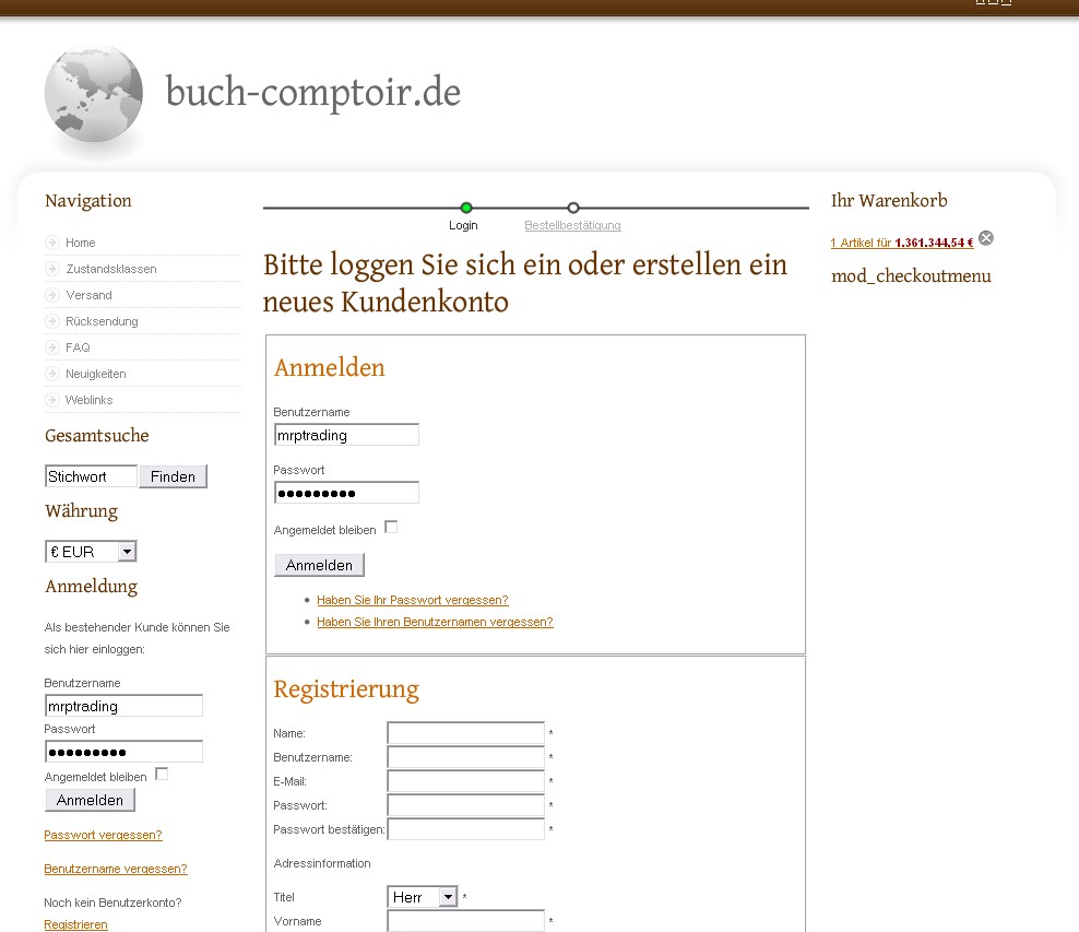
thanks a lot both of you. I had a similar width problem, and now hope to having fixed it this way - below changes in red in file "//media/com_hikashop/css/frontend_default.css":
/* checkout login layout */
.hikashop_checkout_login{
clear:both;
width:100%;
margin:auto;
}
.hikashop_checkout_login_left_part{
width:100%;
float:left;
}
.hikashop_checkout_login_right_part{
width:100%;
float:left;
}
As a consequence, the two boxes are now listed one after each other, not side by side anymore, thus I can fill the right column now as intended in the template I use.
Don't know if it works for you readers, however maybe it is of some help.
Regards, M. 
 HIKASHOP ESSENTIAL 60€The basic version. With the main features for a little shop.
 HIKAMARKETAdd-on Create a multivendor platform. Enable many vendors on your website.
 HIKASERIALAdd-on Sale e-tickets, vouchers, gift certificates, serial numbers and more!
 MARKETPLACEPlugins, modules and other kinds of integrations for HikaShop


