module placement on page- aslo shipping questions

  • Posts: 117
  • Thank you received: 0
13 years 5 months ago #19341

Hi
I have a few more things I need to sort out. Please can you help again?

Firstly, I have been trying to get the joomla content in the main page, to sit in the same position as my product pages. So, at the moment, if you go from the home page on the site ( www.acrossthetracksrecords.com ) to a products page, The content moves down the page.
I am using firebug, and can only really identify a way to move both of these pages down, via the joomla template. I have tried to identify what to alter in the hikshop css, but cannot figure it out.

Secondly. I have been testing out the buying process on the site and there are a few things I wish to sort out.
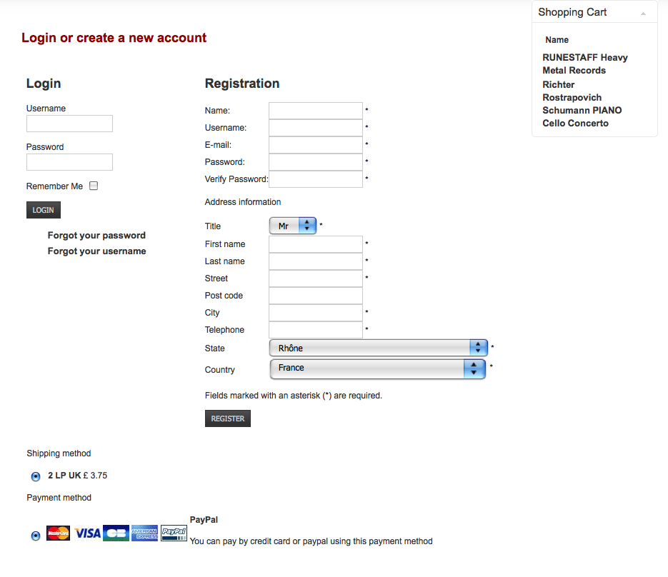
When I add n item to the cart, the default country in the drop down box is France, with a region. I would like it to show UK as default if possible. In addition (see attached screen shot) It is showing 2 LPs UK as the shipping method. If it uses UK as the default method this is correct, but if it is using Europe (as France is showing in the drop down box) Then it is in correct. I have deleted UK from the Europe zone, as I have a separate UK zone.

Thirdly, I see that my whole shopping trolley box is taken up by two titles. I am not sure what to do about this, as it looks rather clumsy. The long titles are needed in the listings, but is there a way of having a shorter title on the listing (which would show in the trolley) and the start of the description?

THanks once again for your brilliant help!!
Attachments:

Please Log in or Create an account to join the conversation.

  • Posts: 82868
  • Thank you received: 13376
  • MODERATOR
13 years 5 months ago #19350

Hi,

1. The joomla article you have on your first page is displayed as main content. When you click on a link of a menu/module, the content of the link is displayed on your main content. If you want your article to be displayed everywhere, you shouldn't display it as a menu of the home page. Instead, you should create a new module displaying that article and then publish it to a position where it would be displayed on all of your pages.

2. The custom fields can be managed via the menu Display->Custom fields. You will be able to change their default values there. Shipping methods are only displayed based on the restrictions you set in the shipping method and the current cart state. On the screenshot you provide, you're not yet logged in, so the system uses the "main tax zone" option of your configuration as the current shipping zone.

3. There is no option for that. You would have to edit the view of the cart and change the code there for that:
www.hikashop.com/en/support/forum/4-how-...for-cart-module.html

Please Log in or Create an account to join the conversation.

  • Posts: 117
  • Thank you received: 0
13 years 5 months ago #19426

Thanks for the help. I am getting there. I now have United Kingdom as default country in the registration form.

With regard to the first question, I think I was not very clear on what I was asking. I want to style the hika shop pages, independently of the joomla pages. At present, titles "home, contact, about us" are nearer the top of the page, than the category titles on the product pages. But I cant seem to style them independently of each other. I want the titles to be the same distance from the top on all pages.

With regard to the shopping trolley issue, I have looked at the links, and it all looks a bit too complicated for me. I find php a bit scary!!! So, I think I would like to style this element separately. At the moment the font size and weight etc is being governed by the joomla template. Please can you tell me how to style this separately.

Thanks once again. You have the patience of a saint!!

Please Log in or Create an account to join the conversation.

  • Posts: 82868
  • Thank you received: 13376
  • MODERATOR
13 years 5 months ago #19427

You need to change the CSS code:
h2.contentheading, .contentheading {
padding: 5px 0 8px;
margin: 0;
font-weight: bold;
color: #900000;
}

to:
h2, .contentheading {
padding: 5px 0 8px;
margin: 0;
font-weight: bold;
color: #900000;
}

in your template CSS file: www.acrossthetracksrecords.com/templates...ity/css/template.css


if you want to style some parts of the cart module with CSS, you shouldlook with firebug to the classes used in the cart module and use them in your CSS.
For example, for the name of the products in the cart, you can use the class hikashop_cart_module_product_name_value like that:
.hikashop_cart_module_product_name_value{ color : green; }

Please Log in or Create an account to join the conversation.

  • Posts: 117
  • Thank you received: 0
13 years 5 months ago #19429

You need to change the CSS code:
h2.contentheading, .contentheading {
padding: 5px 0 8px;
margin: 0;
font-weight: bold;
color: #900000;
}

to:
h2, .contentheading {
padding: 5px 0 8px;
margin: 0;
font-weight: bold;
color: #900000;
}

in your template CSS file: www.acrossthetracksrecords.com/templates...ity/css/template.css


if you want to style some parts of the cart module with CSS, you shouldlook with firebug to the classes used in the cart module and use them in your CSS.
For example, for the name of the products in the cart, you can use the class hikashop_cart_module_product_name_value like that:
.hikashop_cart_module_product_name_value{ color : green; }

nicolas
Moderator
Posts: 8117
graph
User Online Now Click here to see the profile of this user


I have been styling the two elements you mention, but that moves the headings up on both the joomla, and the hika shop pages, which is what I want to avoid.

The class you mention that I should add... Should thatbe in the template css or the hika shop css?

Please Log in or Create an account to join the conversation.

  • Posts: 82868
  • Thank you received: 13376
  • MODERATOR
13 years 5 months ago #19431

The modification I talked about enables both headings to use the same CSS definition where actually only the non hikashop headings get that CSS.

Where you add the CSS is not important. It should work indifferently in both CSS.

Please Log in or Create an account to join the conversation.

  • Posts: 117
  • Thank you received: 0
13 years 5 months ago #19497

Please can you help further?

I changed the css mentioned above, but still am not able to make the title on the home page the same distance from the top, as the hikashop product pages. I see it is governed by the code
#ja-mainbody #ja-contentwrap {
float: right;
padding-top: 25px;
width: 75%;

But, if I change this, the titles on both pages move up?

In addition, I have had a go at styling the shoping cart, with some success. However, the code I have added is causing other problems.

.hikashop_cart_module_product_name_value

a:hover, a:active, a:focus {

text-decoration: none;
font-size: 10px;
}

This is perfect for the shopping trolly, but all the links on the rest of the site, now chage to a smaller font on hover, active etc.

Can you please help me sort these two problems.

Last edit: 13 years 5 months ago by sarsells.

Please Log in or Create an account to join the conversation.

  • Posts: 82868
  • Thank you received: 13376
  • MODERATOR
13 years 5 months ago #19501

Please try to change the CSS with that one then:
h2, h1, .contentheading {
padding: 5px 0 8px;
margin: 0;
font-weight: bold;
color: #900000;
}

For your second problem, that's because your CSS is not correct. It should be:
.hikashop_cart_module_product_name_value a:hover, .hikashop_cart_module_product_name_value a:active, .hikashop_cart_module_product_name_value a:focus {
text-decoration: none;
font-size: 10px;
}

Please Log in or Create an account to join the conversation.

  • Posts: 117
  • Thank you received: 0
13 years 5 months ago #19513

Thank you for that. I have now sorted both of these with your help.

Please Log in or Create an account to join the conversation.

Time to create page: 0.073 seconds
Powered by Kunena Forum