Hi,
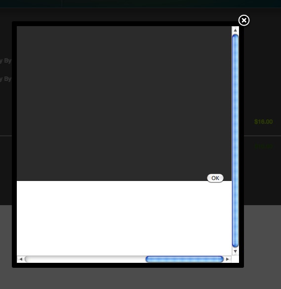
It strange that the popup content streches that much. That doesn't happen on our end.
Anyway, you can easily do that by editing the view. Go to the menu Display->Views and search for the file form of the view address and edit it.
There, near the bottom you have the line
echo $this->cart->displayButton(JText::_('OK'),'ok',$this->params,hikashop::completeLink('address&task=save'),'if(hikashopCheckChangeForm(\'address\',\'hikashop_address_form\')) document.forms[\'hikashop_address_form\'].submit(); return false;','style="float:right"');that you can replace by
echo $this->cart->displayButton(JText::_('OK'),'ok',$this->params,hikashop::completeLink('address&task=save'),'if(hikashopCheckChangeForm(\'address\',\'hikashop_address_form\')) document.forms[\'hikashop_address_form\'].submit(); return false;','style="float:left"');
In next version of HikaShop, we are going to change that to use CSS so that you can more easily edit it.
 HIKASHOP ESSENTIAL 60€The basic version. With the main features for a little shop.
 HIKAMARKETAdd-on Create a multivendor platform. Enable many vendors on your website.
 HIKASERIALAdd-on Sale e-tickets, vouchers, gift certificates, serial numbers and more!
 MARKETPLACEPlugins, modules and other kinds of integrations for HikaShop


