Hello,
there is something weird happening and I have no idea.
I imported my shop from VM and everything displayed nicely.
I then upgraded from starter to business.
I have now started creating new categories and products and things aren't displaying like the stuff I imported from VM.
I've created a menu item to display a category.
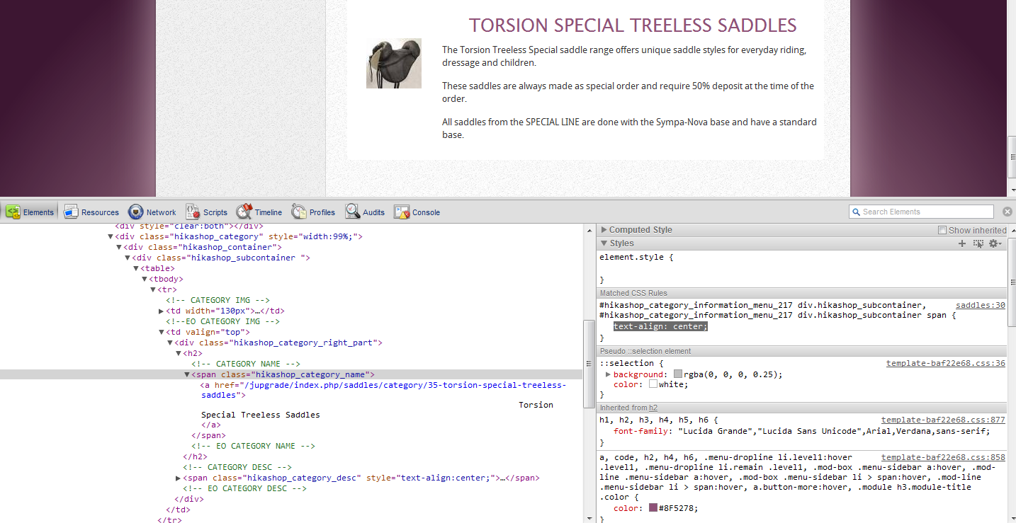
For some reason, the image is on the left (that's ok) but the category description and its title are centred instead of left aligned like the stuff imported. I can get around it by left aligning manually in the description, but it's annoying as I have to do this for all new categories. Is there a setting somewhere to have it left align automatically?
There is one thing I changed in the CSS is to float the image category on the left but I don't thing this should affect the text alignment. I checked the source code and the text is centred with inline CSS.
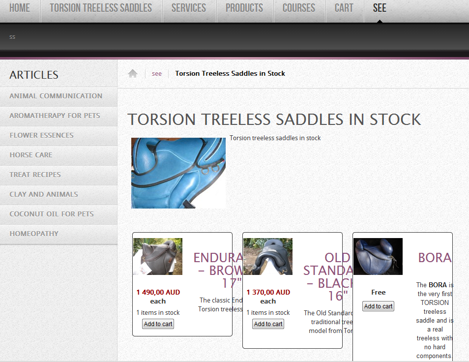
Now, from the category I'm displaying with the menu, it displays the sub categories as intended. When I click on the subcat link, it takes me to a page to display its products.
And this is all badly displayed with title too big and going over the product box. See screen shot.

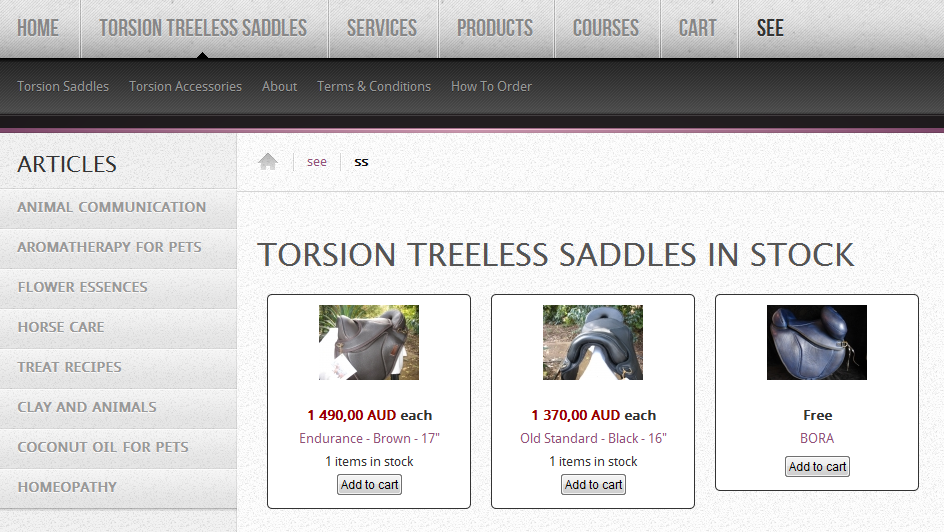
I've created a submenu to display the subcat above and I managed to have it looking the way I want. See screen shot.
How do I get the same category to display like this without having to use a menu?
thanks
 HIKASHOP ESSENTIAL 60€The basic version. With the main features for a little shop.
 HIKAMARKETAdd-on Create a multivendor platform. Enable many vendors on your website.
 HIKASERIALAdd-on Sale e-tickets, vouchers, gift certificates, serial numbers and more!
 MARKETPLACEPlugins, modules and other kinds of integrations for HikaShop


