No choice of "state" when editing billing address

  • Posts: 27
  • Thank you received: 0
13 years 10 months ago #4559

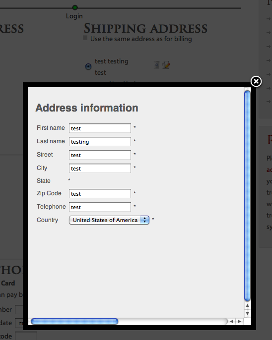
A customer (woo hoo!!) brought to my attention today that he wasn't able to choose a state when editing his shipping address at checkout. I tested it, and see that this happens in all the different browsers I have on both Macs and PCs. Any thoughts on what I can do to fix this?

Attachments:

Please Log in or Create an account to join the conversation.

  • Posts: 82906
  • Thank you received: 13378
  • MODERATOR
13 years 10 months ago #4566

I remember that there was such issue in a previous version of HikaShop. Could you try to update to the latest version ? ( you can download it directly on our website because we didn't published it yet for update so you won't be able to get it via the menu Update/Update us )

Please Log in or Create an account to join the conversation.

  • Posts: 27
  • Thank you received: 0
13 years 10 months ago #4577

That did the trick!

However, now I have two new minor issues:
1. Now there are two "New" buttons under the billing and shipping (when "same as billing" is unchecked) addresses.
2. I have the popup notice when an item is added to the cart. That popup is now looking different:
a. Now that the "continue shopping" and "proceed to checkout" buttons are on a single line instead of stacked (yay), the popup is now too narrow to see "proceed to checkout" (boo)
b. that popup closes too quickly for most people
How do I fix these?

Last edit: 13 years 10 months ago by mollyf. Reason: clarity

Please Log in or Create an account to join the conversation.

  • Posts: 82906
  • Thank you received: 13378
  • MODERATOR
13 years 10 months ago #4578

1. You're right, that's a bug introduced yesterday in the hikashop package. It's now fixed. Please download again hikashop and install it again. That should fix the problem.

2.a You can edit the hikashop CSS ( tab display of the configuration ) and use the CSS classes hikashop_add_to_cart_continue_div and hikashop_add_to_cart_checkout_div to put them one below the other. Maybe with a float:left; ?

2.b You can edit the popup file via the menu Display->Views. You can edit the file notice of the view checkout for that.
You will find the line

setTimeout( 'try{	window.top.document.getElementById(\'sbox-window\').close(); }catch(err){ window.top.SqueezeBox.close(); }', 2000 );
where 2000 defines the time the popup is open, 2000 ms. You can just set it to want you want and save the view.

Please Log in or Create an account to join the conversation.

  • Posts: 27
  • Thank you received: 0
13 years 10 months ago #4579

Perfect! Thank you very much!

Please Log in or Create an account to join the conversation.

  • Posts: 27
  • Thank you received: 0
13 years 10 months ago #4582

One note about reinstalling HikaShop: I'm so glad I have a backup of my highly customized language file. Reinstalling is very easy and all of my settings from the database are intact. However, the language file is overwritten. I'm sure most people are smart enough to keep good backups. I'm not, usually, but I'm learning.

Please Log in or Create an account to join the conversation.

  • Posts: 82906
  • Thank you received: 13378
  • MODERATOR
13 years 10 months ago #4583

Yes. That's the only point on which we need to work on for the update. Actually, when you update, if you made changes to your translation file. They will be removed.

There will be a solution with joomla 1.6 to use language files override. We might use that and try to make it work in joomla 1.5 for hikashop.

Please Log in or Create an account to join the conversation.

  • Posts: 4
  • Thank you received: 0
13 years 9 months ago #6360

bump

In which file could I find the line:?
"setTimeout( 'try{ window.top.document.getElementById(\'sbox-window\').close(); }catch(err){ window.top.SqueezeBox.close(); }', 2000 );"

Where can I change the Text/background/border format/color in the popup notice that the product has been added?

Please Log in or Create an account to join the conversation.

  • Posts: 82906
  • Thank you received: 13378
  • MODERATOR
13 years 9 months ago #6373

It's in the file notice of the view checkout that you can edit via the menu Display->Views in HikaShop.

The CSS of that view should be handled by your template. You can ask your template provider about the tmpl=component styling. However, you can also add directly put your style in that view file if you have difficulties with your template.

Please Log in or Create an account to join the conversation.

  • Posts: 107
  • Thank you received: 0
13 years 9 months ago #6773

Maybe I'm a complete fool, but I can't find the file you're talking about ... could ypou give us a filename.php and a line please ... that would be very helpfull

Please Log in or Create an account to join the conversation.

  • Posts: 82906
  • Thank you received: 13378
  • MODERATOR
13 years 9 months ago #6789

You can go in the menu Display->Views. There, on the left you have a search box. Please type "notice" (without the quotes) and click on go. That should bring you only one result. You can click on the file name to edit it.

If you edit the file directly, you will loose your modifications when you update hikashop (it's the file components/com_hikashop/views/checkout/tmpl/notice.php ).

Please Log in or Create an account to join the conversation.

  • Posts: 107
  • Thank you received: 0
13 years 9 months ago #6869

I wasn't up to date .. that's why .. found the file... thanks a million :)

Please Log in or Create an account to join the conversation.

  • Posts: 14
  • Thank you received: 0
13 years 7 months ago #15045

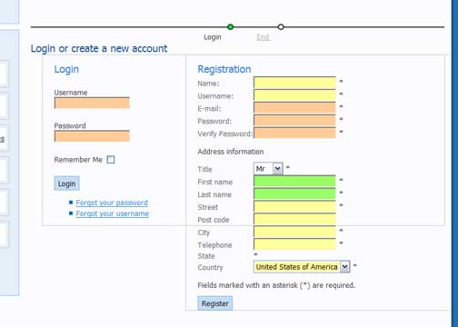
I'm not able to choose a state when editing my shipping address at checkout. I'm using the HikaShop Starter 1.4.9. Please help...

The other issue is css style at checkout process... i can't change width for the login and registration.

Attachments:

Please Log in or Create an account to join the conversation.

  • Posts: 82906
  • Thank you received: 13378
  • MODERATOR
13 years 7 months ago #15060

Please check that thread with several solutions to the problem: www.hikashop.com/en/support/forum/3-bug-...ligned-checkout.html

Please Log in or Create an account to join the conversation.

  • Posts: 14
  • Thank you received: 0
13 years 7 months ago #15097

Thanks, Nicolas! I decided to add the states manual.. It works!!
Do you have any solution for css style at login and registration page. I try to change width for those 2 "boxes"... still no luck.

Please Log in or Create an account to join the conversation.

  • Posts: 82906
  • Thank you received: 13378
  • MODERATOR
13 years 7 months ago #15112

I can't give precise CSS without being able to see the page with firebug. If you could give a link to your shop, that would help.

Please Log in or Create an account to join the conversation.

  • Posts: 14
  • Thank you received: 0
13 years 7 months ago #15115

Please Log in or Create an account to join the conversation.

  • Posts: 14
  • Thank you received: 0
13 years 7 months ago #15116

Please Log in or Create an account to join the conversation.

  • Posts: 82906
  • Thank you received: 13378
  • MODERATOR
13 years 7 months ago #15118

So what is the problem ?
I see the registration view below the login view on your checkout. It seems fine to me.

Please Log in or Create an account to join the conversation.

  • Posts: 14
  • Thank you received: 0
13 years 7 months ago #15120

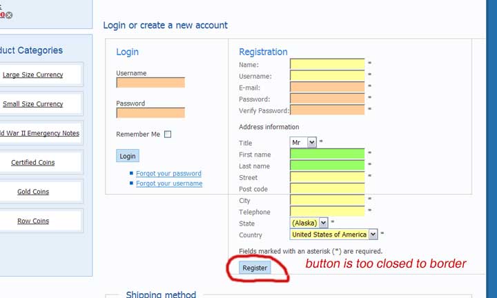
Nicolas, please see the attached file. The login and registration fieldsets are overlapped... I want to put login fieldset on the left side and registration on the right side. Also I have a problem z the button... it is to closed to bottom border of the fieldset.

Attachments:

Please Log in or Create an account to join the conversation.

Time to create page: 0.097 seconds
Powered by Kunena Forum