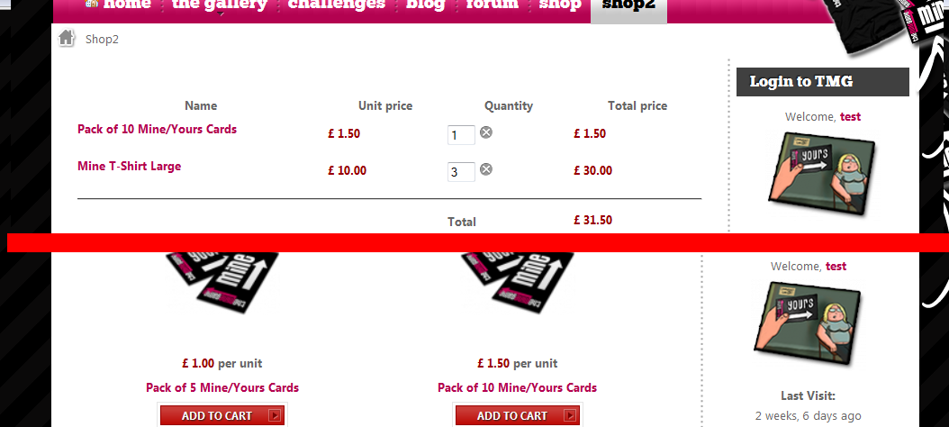
Checkout page breaking sidebar width

  • Posts: 37
  • Thank you received: 0
13 years 10 months ago #5626

On my checkout pages my sidebar gets reduced from what it should be, breaking my layout a little in places.

I have attached a screenshot. The top section shows the checkout page with the width of the sidebar smaller than it should be, the bottom section shows the product list page with the sidebar the correct width.

I cannot figure out where to change this.

In the css I have looked at the

#hikashop_checkout_page

element and tried adding a width attribute to it, I have tried all of the following with no luck;
#hikashop_checkout_page div.hikashop_cart_bar{
	text-align:center;
    width: inherit;
}


#hikashop_checkout_page div.hikashop_cart_bar{
	text-align:center;
    width: auto;
}

#hikashop_checkout_page div.hikashop_cart_bar{
	text-align:center;
    width: 100%;
}

#hikashop_checkout_page div.hikashop_cart_bar{
	text-align:center;
    width: 90%;
}

I have also tried changing the width of the cart table, again with no luck on reducing the width of the entire checkout page.

I am looking with firebug but I can't seem to figure out what I need to change/add!

Thanks in advance
Simon

Attachments:
Last edit: 13 years 10 months ago by recedo.

Please Log in or Create an account to join the conversation.

  • Posts: 37
  • Thank you received: 0
13 years 10 months ago #5627

Think I have figured this one out by myself now.

I found in the css;

/* checkout address layout */
.hikashop_checkout_address{
	clear:both;
	width:700px;
	margin:auto;
}

I will play with this and hopefully sort my problem.

Simon

Please Log in or Create an account to join the conversation.

  • Posts: 82863
  • Thank you received: 13372
  • MODERATOR
13 years 10 months ago #5628

Each view of the checkout has a div around it with the class hikashop_checkout_VIEW where VIEW is the name of the view.

On your screenshot, I see the cart view of the checkout. So you should look at the CSS for hikashop_checkout_cart.

Please Log in or Create an account to join the conversation.

  • Posts: 37
  • Thank you received: 0
13 years 10 months ago #5629

Thanks - I see that several elements have widths defined - would it not make more sense giving them percentages so they fit more peoples templates?

Please Log in or Create an account to join the conversation.

  • Posts: 82863
  • Thank you received: 13372
  • MODERATOR
13 years 10 months ago #5630

Percentages don't work in a lot of cases. We found that the fiwed width we set by default are the best so far with template compatibility.
Besides, it is easy to change them by just editing the hikashop CSS via the interface in the config.

Please Log in or Create an account to join the conversation.

  • Posts: 37
  • Thank you received: 0
13 years 10 months ago #5632

Just out of interest - why don't percentages work in some cases?

Going through my checkout pages now changing the widths - it's easy enough but would be nice for the pages to just fit to the container no matter what size I have it set to, as it does with the category/product views.

Thanks again
Simon

Please Log in or Create an account to join the conversation.

  • Posts: 82863
  • Thank you received: 13372
  • MODERATOR
13 years 10 months ago #5637

There is no width set for most of the views of the checkout. Only the login and address views have it set. That is because the views width changes based on the options and what is in your cart. You might get only the left part or only the right part or both of them.

Please Log in or Create an account to join the conversation.

Time to create page: 0.071 seconds
Powered by Kunena Forum