Recipient Address Creation Flow is Confusing

  • Posts: 284
  • Thank you received: 6
7 years 7 months ago #267561

-- HikaShop version -- : 3.0.1
-- Joomla version -- : 3.6.5

My client is a florist. The checkout address needs to show BILLING ADDRESS and a DELIVERY/RECIPIENT ADDRESS.

However, the current workflow is very confusing.
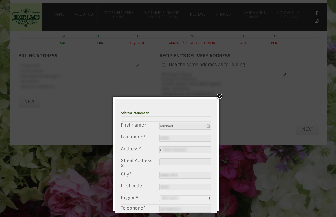
If you UNSELECT the 'Use the Same Address as for Billing' checkbox then the BILLING ADDRESS' comes up in a pop-up already fully populated with the billing address. Why? The person just made the decision to NOT USE THE BILLING ADDRESS when they unchecked the box.
This is illogical.
(see attached)

UNSELECTING the 'Use the Same Address as for Billing' checkbox should bring up a BLANK ADDRESS WINDOW with some sort of heading that says: Please Enter Recipient's/Shipping Address
This action should be the same as clicking NEW (but the NEW button does not show up until after you uncheck that box). Eh?

This is adding more confusing steps when the customer simply wants to ADD a Shipping or Delivery address that is DIFFERENT than the Billing Address.

Attachments:
Last edit: 7 years 7 months ago by MSTACE.

Please Log in or Create an account to join the conversation.

  • Posts: 82868
  • Thank you received: 13377
  • MODERATOR
7 years 7 months ago #267565

Hi,

This is done on purpose so that the customer has less things to fill in the form. It is a new address form, but with the fields prefilled so that the customer just has to change the information that is different for the new shipping address.
Now if you want to change that, it is still possible with some code modification but we won't change that as that's the legacy checkout you're using. The new checkout system (which you can use by turning off the "checkout legacy" setting of the HikaShop configuration has a new address system completely redesigned to make it less confusing and avoid such issues.

Please Log in or Create an account to join the conversation.

  • Posts: 284
  • Thank you received: 6
7 years 7 months ago #267589

The Legacy Checkout is on by default, by the way.

This new one is much better.

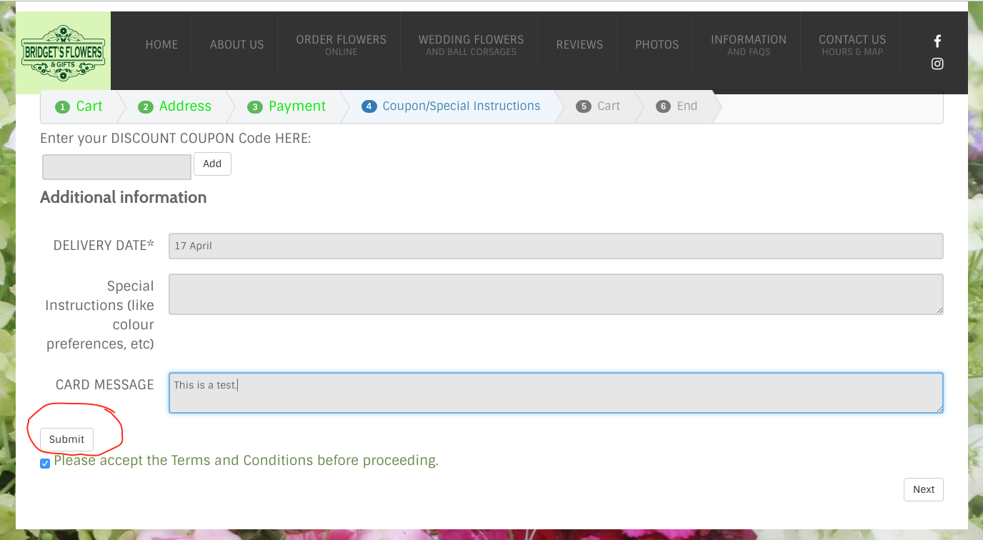
I do have an odd SUBMIT button that is showing up after the FIELDS section and before Terms and Conditions.
(see attached)

It doesn't seem to be doing anything.
How to remove it?

Attachments:

Please Log in or Create an account to join the conversation.

  • Posts: 82868
  • Thank you received: 13377
  • MODERATOR
7 years 7 months ago #267591

Hi,

It does something. It submits the data of the fields without validating the whole page.
But you can remove it if you don't need it. You can do that with CSS you can add to your website:
www.hikashop.com/support/documentation/1...ize-the-display.html

Please Log in or Create an account to join the conversation.

  • Posts: 284
  • Thank you received: 6
7 years 7 months ago #267619

Thanks.
I hid the button.

Please Log in or Create an account to join the conversation.

Time to create page: 0.072 seconds
Powered by Kunena Forum