Hello,
Do not use private message to contact the team ; it's unfortunately useless because we are a team, we can't see PM of other users and PM is not a way to provide good support.
Thank you for your understanding.
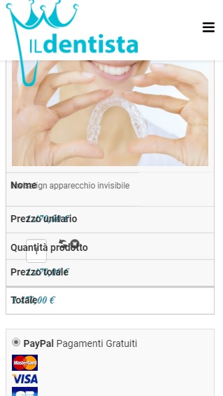
Now about your issue ; it's something "recurrent" and it's an issue generated by your template.
You have two way to fix it (not in the same time. It's one.. or the other).
1 - Rectify the padding to mark it important.
In the HikaShop frontend CSS you will find that rule :
	.hikashop_checkout_cart table td {
		border: none;
		border-bottom: 1px solid #eee;
		position: relative;
		padding-left: 30%;
	}
You need to set the paddin-left as important to force that padding and not let your template break it.
2 - Removing the "position absolute".
In the HikaShop frontend CSS you will find that rule :
	.hikashop_checkout_cart table td:before {
		position: absolute;
		left: 6px;
		padding-right: 10px;
	}
You need to remove the position absolute so the content will be display in two lines.
Regards,
 HIKASHOP ESSENTIAL 60€The basic version. With the main features for a little shop.
 HIKAMARKETAdd-on Create a multivendor platform. Enable many vendors on your website.
 HIKASERIALAdd-on Sale e-tickets, vouchers, gift certificates, serial numbers and more!
 MARKETPLACEPlugins, modules and other kinds of integrations for HikaShop


