Hi,
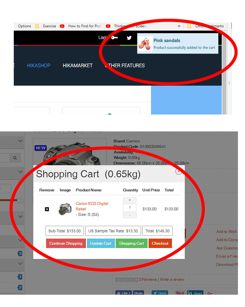
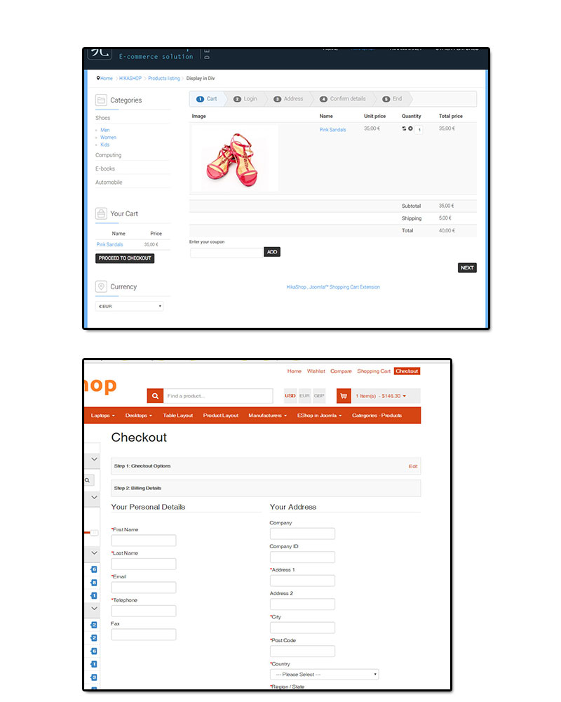
I checked their demo website and I don't see where their cart popup or checkout is "better" than ours.
It's a different concept, where we only display the image and name of the product with two buttons in the popup instead of the whole cart with lots of buttons. I personally prefers ours, which has less elements.
And regarding the checkout, their checkout is a cross between a real one page checkout (which you can do with HikaShop) and a several pages checkout displayed as a false accordeon.
But besides that, within each view it basically displays similarily to what you have in each view of the checkout of HikaShop.
Now, I agree that having the possibility to have the whole cart in the add to cart popup could be something nice to add. But besides that, I can't agree with what you're saying.
 HIKASHOP ESSENTIAL 60€The basic version. With the main features for a little shop.
 HIKAMARKETAdd-on Create a multivendor platform. Enable many vendors on your website.
 HIKASERIALAdd-on Sale e-tickets, vouchers, gift certificates, serial numbers and more!
 MARKETPLACEPlugins, modules and other kinds of integrations for HikaShop


