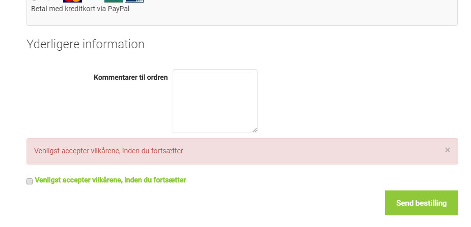
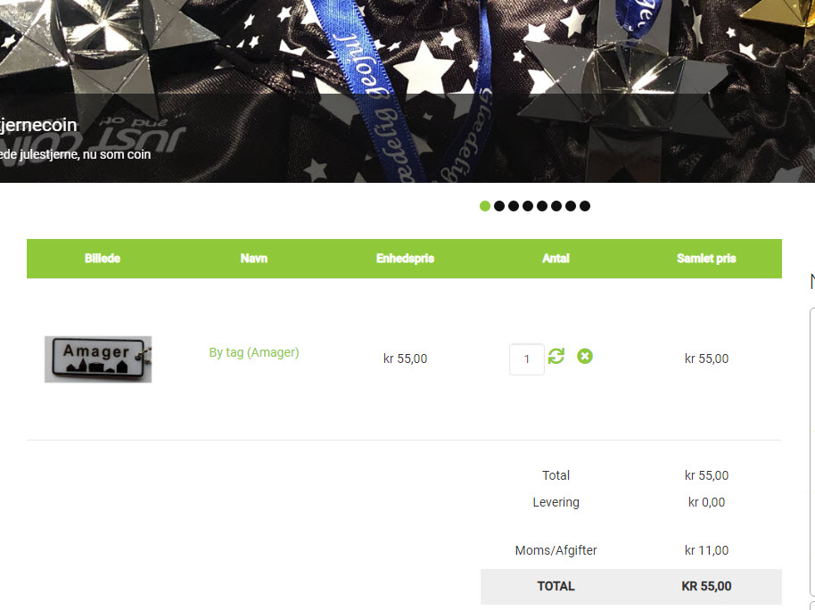
Error message shown next to field but page is scrolled up

  • Posts: 86
  • Thank you received: 3
5 years 6 months ago #306066

-- HikaShop version -- : 4.0.3
-- Joomla version -- : 3.9.5
-- PHP version -- : 7.1.28
-- Browser(s) name and version -- : Chrome

Hi

I have a one-page checkout process.
The last field before the Buy button is the Terms and conditions.
If a customer forgets to check the Terms and conditions box, then the page is reloaded and scrolled to the top of the page.
The error message indicating that something went wrong is next to the terms and conditions box at the bottom of the page.

How do I either get the error message to the top of the page or preferrably stop the page from scrolling up/reloading if the terms and conditions is not checked?

I have tried with the default joomla template, and the same error occurs.


Rgds
Jacob

Attachments:

Please Log in or Create an account to join the conversation.

  • Posts: 4747
  • Thank you received: 644
  • MODERATOR
5 years 6 months ago #306088

Hello,

I think that you can adjust this with some Css, see my screenshot :


To detail the Css code, you have :
- position: absolute;
=> Here, you fix a definitive position for your error message.
- top, left & width are to be define to fit your needs and the right position in your case
=> Don't forget to add some command to work as well for responsiveness.
Example :
div#hikashop_checkout_terms_1_5 div#hikashop_messages_error {
position: absolute;
top: 47px;
left: 34.3%;
width: 380px;
}
@media (max-width:768px) {
div#hikashop_checkout_terms_1_5 div#hikashop_messages_error {
position: absolute;
top: 47px;
left: different value to fit the new context (screen size);
width: different value to fit the new context (screen size);
}
}

You will learn more about @media, here. www.w3schools.com/cssref/css3_pr_mediaquery.asp
Hope this will fit your needs.

Regards

Last edit: 5 years 6 months ago by Philip.

Please Log in or Create an account to join the conversation.

  • Posts: 86
  • Thank you received: 3
5 years 6 months ago #306094

Well...
Using css to move the error box seems like a half-baked solution.
The content of the page doesn't move down to make room for the errormessage. the errormessage is just put on top, and any slight change to the size of anything on the site will have to result in a new calibration of this errormessage.

Isn't the a more elegant solution?
Is this how it is supposed to work?

regards
Jacob

Please Log in or Create an account to join the conversation.

  • Posts: 86
  • Thank you received: 3
5 years 6 months ago #306095

The errormessage should be posted next/above to the field causing the error.
And the page should scroll down to the first error. This would be the way to do it (in my humble opinion)

Rgds
Jacob

Please Log in or Create an account to join the conversation.

  • Posts: 4747
  • Thank you received: 644
  • MODERATOR
5 years 6 months ago #306101

Hello,

My answer was a custom to match your needs, and not a general solution for everyone.
So far, their is no easy and quick solution to implement solutions.
The anchor system can be indeed a solution but this can be complicated and take time to implement.

You ask us to have the error message directly when the page is refresh that the most direct solution.
But we know that you have to set yourself position for several screen size via @media, also think that for values you can use values in %.

Plus, note that many form proceed like this, to have error message on header, that invite customer to check the whole form.
But we get your point and add an anchor system, this won't maybe be the next release but quite soon in our HikaShop future release.

Regards

Last edit: 5 years 6 months ago by Philip.

Please Log in or Create an account to join the conversation.

  • Posts: 86
  • Thank you received: 3
5 years 5 months ago #307428

Hi

I saw that you had implemented an anchor system for this problem.
I have updated to the newest version 4.1.0, but it doesn't look as if it's working...

Rgds
Jacob

Please Log in or Create an account to join the conversation.

  • Posts: 82864
  • Thank you received: 13372
  • MODERATOR
5 years 5 months ago #307449

Hi,

The auto scroll system doesn't address what you're talking about.
The goal of that system is to scroll up automatically when a view is submit and an error message is displayed before the area the user is looking at (which is an important problem as the user might not think of scrolling up and miss it).
In your case, the user get the message after the area he is looking at. As it need to scroll down to access the continue / finish button anyways, he will come accross the error message at one point. There is no reason he should miss the message, in that case. So that's why we consider this issue less problematic and didn't deal with that. Not only that, but in my opinion, when a full page refresh occurs, you don't necessarily want to scroll down automatically. And you don't necessarily want to have all the error messages at the top. If you do that, then it's less obvious for the customer what area has a problem on the page. I guess it depends more on your preferences and how your checkout is setup. It's not something we necessarily want to change for everyone. In fact, HikaShop was displaying all the error messages at the top of the checkout in HikaShop 2, and have the messages closer to the area where the problem was was a request we received several times, which is why we changed the way it worked for the new checkout in HikaShop 3.

Please Log in or Create an account to join the conversation.

  • Posts: 86
  • Thank you received: 3
5 years 5 months ago #307492

OK, I thought it was related to my problem.

I have had customers that had forgotten to set a checkmark at the conditions and just hit Order.
The page refreshed and as there were no errormessage shown (on the visible part of the page) the customer thought the order was successfull.
This especially occurs with orders that do not need a separate payment page - for those the customr expects a new page.

Regards
Jacob

Please Log in or Create an account to join the conversation.

  • Posts: 82864
  • Thank you received: 13372
  • MODERATOR
5 years 5 months ago #307500

Hi,

Thank you for your feedback on the issue faced by your customer.

Please Log in or Create an account to join the conversation.

Time to create page: 0.084 seconds
Powered by Kunena Forum