Hi,
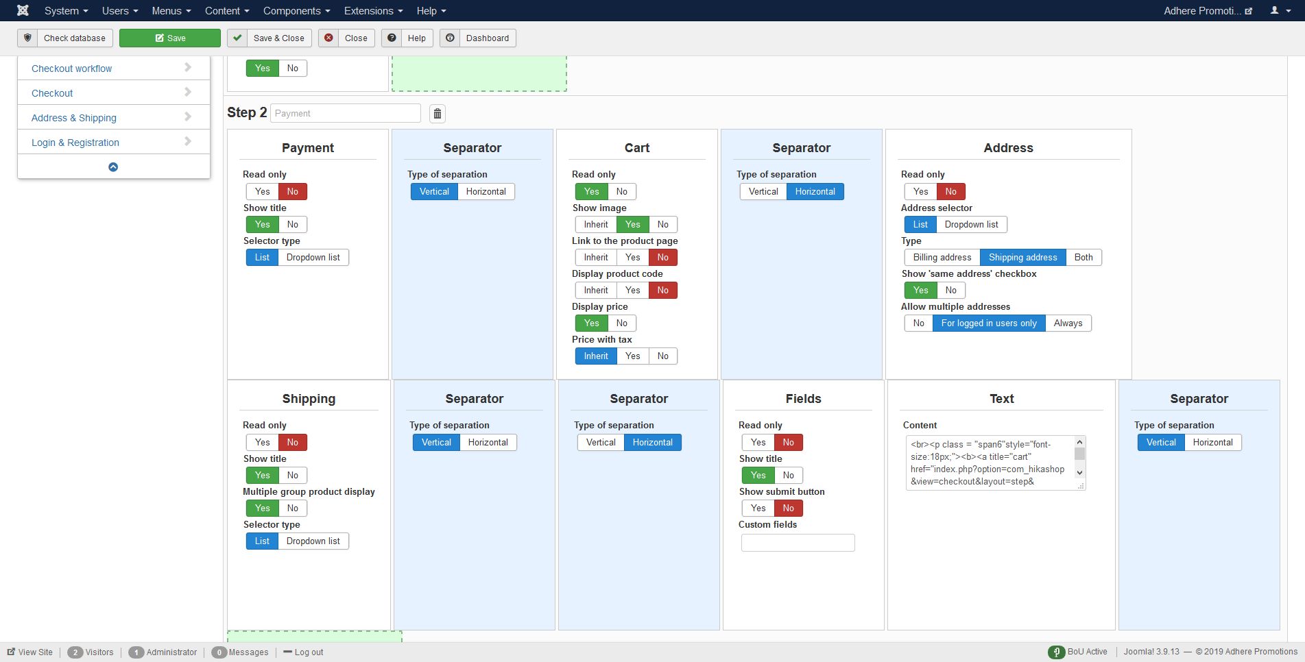
First i think you shouldn't use so many seperators in one step. Basically you want to add one seperator between left and right columns only. So in you case you should add seperator between your cart block and other blocks.
So what it does, it moves cart block to the right and other views to the left.
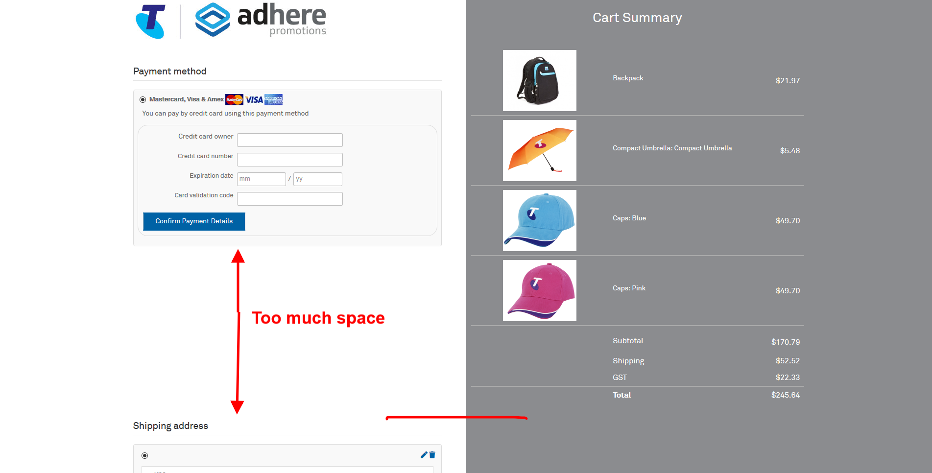
Now, adding max height to reduce the hight of the cart is good practise here. However you scrollbar on the right should be visible and some text showing how many items in cart should be somewhere near "cart summary" so if the user has 4 items and u set max height to show only 2, the user while looking to the cart will see scrollbar and how many items he has in the cart, will understand that he needs to use scrollbar to see other items. So UI/UX is good here.
Now, on mobile it is different story. You should get rid of the scrollbar because people intend to scroll to bottom on mobile and having another vertical scroll is not good practise from UI/UX. IHowever if user have like 20 items in cart the cart block could be to long...What you want is to make items display inline and add horizontal scroll or add some button where on click it will show hes cart...Where are other things which could be done for better UI/UX but it is long story tho...
Hope that helps a bit.
Regards
 HIKASHOP ESSENTIAL 60€The basic version. With the main features for a little shop.
 HIKAMARKETAdd-on Create a multivendor platform. Enable many vendors on your website.
 HIKASERIALAdd-on Sale e-tickets, vouchers, gift certificates, serial numbers and more!
 MARKETPLACEPlugins, modules and other kinds of integrations for HikaShop


