Hi,
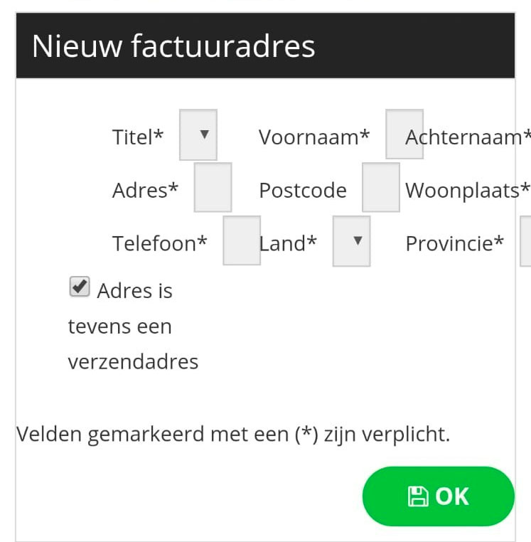
The fact that you have several columns for your address edition comes from your template CSS:
monosnap.com/file/rOVuUZnjS2lk3NSwDPzgO2MiKaKaMS
So you should ask this question to your template provider so that they can improve the CSS of their template (for others) and at the same time give you the solution.
The solution should be adding CSS code to the template CSS file ( /templates/jd_shop/css/template.css ) . Something along those lines:
@media screen and (max-width: 767px) {
.hikashop_checkout_page .hikashop_checkout_checkout_address_block .hkform-horizontal > .hkform-group {
width: 100% !important;
}
}
 HIKASHOP ESSENTIAL 60€The basic version. With the main features for a little shop.
 HIKAMARKETAdd-on Create a multivendor platform. Enable many vendors on your website.
 HIKASERIALAdd-on Sale e-tickets, vouchers, gift certificates, serial numbers and more!
 MARKETPLACEPlugins, modules and other kinds of integrations for HikaShop


