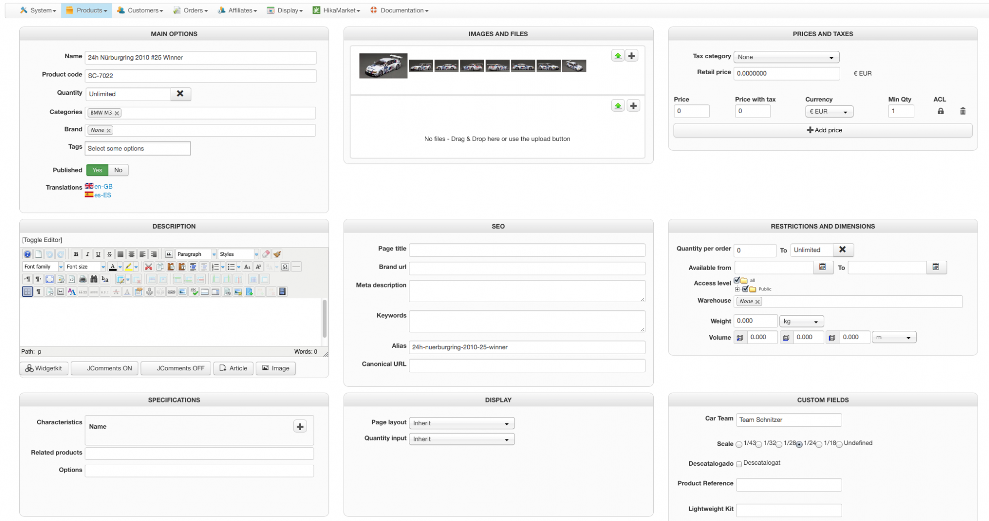
Let me congratulate your team for this. I think is good for everybody, not beginners only.
It makes the data entry more clear and comfortable so I find it a nice improvement together with the Droppable box for pictures, the old system was really horrible!
I hope you could improve together with Obsidev this picture dropping system, I talked with Jerome about it some days ago and changed opinions on how could be improved.
And if you could invent a way to make groups for the Custom fields it would be a lot better, now I have like 50 custom fields and they all show in a column so the scroll is very long. Would be good to be able to assign custom fields to "fieldsets' so they show grouped
Anyhow good job!
 HIKASHOP ESSENTIAL 60€The basic version. With the main features for a little shop.
 HIKAMARKETAdd-on Create a multivendor platform. Enable many vendors on your website.
 HIKASERIALAdd-on Sale e-tickets, vouchers, gift certificates, serial numbers and more!
 MARKETPLACEPlugins, modules and other kinds of integrations for HikaShop


