Hi,
It's both Joomla and HikaShop.
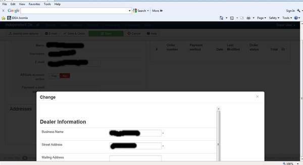
The popup system with firsts version of Joomla 3 had some style errors that we fixed in the HikaShop CSS.
But they finally fixed it and now it generates some troubles with "smaller" screens (below 1280px width).
You can edit the HikaShop backend CSS file and replace
@media only screen and (max-width: 1280px) {
	div.modal.fade.in{
		width: 960px !important;
		margin-left: -480px !important;
		top : 50% !important;
		left: 50% !important;
	}
}
@media only screen and (max-width: 960px) {
	div.modal.fade.in{
		width: 800px !important;
		margin-left: -400px !important;
		top : 50% !important;
		left: 50% !important;
	}
}
@media only screen and (max-width: 800px) {
	div.modal.fade.in{
		width: 640px !important;
		margin-left: -320px !important;
		top : 50% !important;
		left: 50% !important;
	}
}
@media only screen and (max-width: 640px) {
	div.modal.fade.in{
		width: 480px !important;
		margin-left: -240px !important;
		top : 10% !important;
		left: 50% !important;
	}
}
@media only screen and (max-width: 480px) {
	div.modal.fade.in{
		width: 320px !important;
		margin-left: -160px !important;
		top : 10% !important;
		left: 50% !important;
	}
}
By
@media only screen and (max-width: 960px) {
	div.modal.fade.in {
		max-width: 800px !important;
		margin-left: -400px !important;
		left: 50% !important;
	}
}
@media only screen and (max-width: 800px) {
	div.modal.fade.in {
		max-width: 640px !important;
		margin-left: -320px !important;
		left: 50% !important;
	}
}
@media only screen and (max-width: 640px) {
	div.modal.fade.in {
		max-width: 480px !important;
		margin-left: -240px !important;
		top : 5% !important;
		left: 50% !important;
	}
}
@media only screen and (max-width: 480px) {
	div.modal.fade.in {
		max-width: 320px !important;
		margin-left: -160px !important;
		top : 5% !important;
		left: 50% !important;
	}
}
It should improve the popups.
Regards,
 HIKASHOP ESSENTIAL 60€The basic version. With the main features for a little shop.
 HIKAMARKETAdd-on Create a multivendor platform. Enable many vendors on your website.
 HIKASERIALAdd-on Sale e-tickets, vouchers, gift certificates, serial numbers and more!
 MARKETPLACEPlugins, modules and other kinds of integrations for HikaShop


