Product images and Category listing images

  • Posts: 105
  • Thank you received: 0
13 years 7 months ago #14675

Hello,

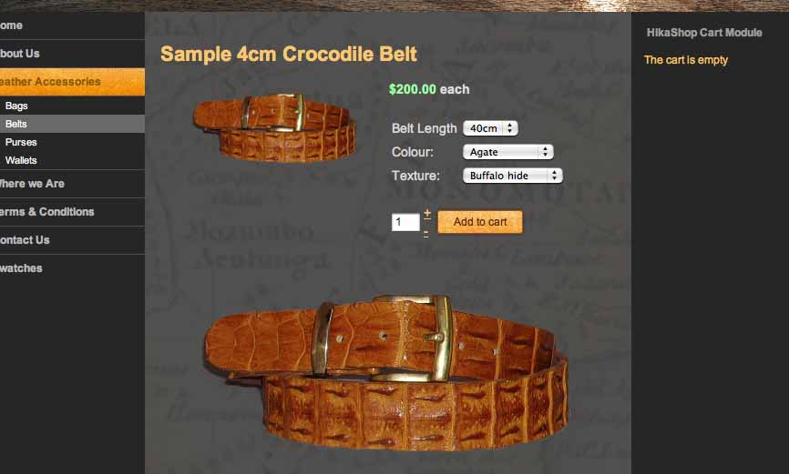
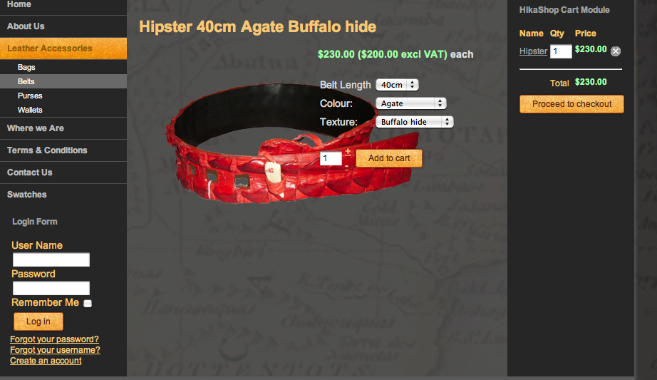
I have two related queries to do with images for individual products and images in the category listing page which connect through to the product page. I attached two screen shots.

1. Under the category of belts, there is a listing with images of all the belts with images. I have input one image here via the product entry via the image add option on the righthand side.
My problem is that there is far too much space between this image and the text below it. If you look at the item below, where I have no image as yet, but you have a default image it is much closer to the text. I have cut the image in size so there is no space in the image either above or below the belt, but there is still a large gap between it and the relevant information. Please can you advise solution.

2. On the product page itself I would prefer a larger image than the image provided by inserting it via the add image as above. Instead I would like to insert the larger image in the article box as shown in my second screen shot sample product. THis gives a better look and feel to the product. However, if I do this, then I get no image showing in the Category listing of all the belts. Obviously, I don't want two images of the belt appearing on the product page. Please can you advise a solution for this.

I look forward to your reply, as always.

Kind regards,

Please Log in or Create an account to join the conversation.

  • Posts: 82863
  • Thank you received: 13372
  • MODERATOR
13 years 7 months ago #14676

1. You need to change the thumbnails size options in the configuration of hikashop under the tab files.

2. You need to edit the file show of the view product via the menu Display->Views and change the code:
if(!$this->config->get('thumbnail')){
to:
if(true){

Please Log in or Create an account to join the conversation.

  • Posts: 105
  • Thank you received: 0
13 years 7 months ago #14678

Thanks. I will try that.

1. This works a treat. Thanks. :woohoo:

2. I have done this, but the thumbnail still appears to left of options as well as the bigger image appearing below.

Any ideas?

Kind regards,

Please Log in or Create an account to join the conversation.

  • Posts: 82863
  • Thank you received: 13372
  • MODERATOR
13 years 7 months ago #14680

Could you do a screenshot ?

Please Log in or Create an account to join the conversation.

  • Posts: 105
  • Thank you received: 0
13 years 7 months ago #14681

Here it is. It looks OK as it is, but my friends might prefer just the large image not the thumbnail as well.
It may be that I am being far too picky here!!!!


Thanks,

Attachments:

Please Log in or Create an account to join the conversation.

  • Posts: 82863
  • Thank you received: 13372
  • MODERATOR
13 years 7 months ago #14743

Strange. that should not look like that as the big image should replace the small one. Both shouldn't be displayed with the modification I told you to do.

Please Log in or Create an account to join the conversation.

  • Posts: 105
  • Thank you received: 0
13 years 7 months ago #14765

Weird that. I will create a new product and see if that happens and get back to you on that. I did do what you suggested, but I will double-check when I have time later today.

Meanwhile thanks for your quick reply - much appreciated.

Please Log in or Create an account to join the conversation.

  • Posts: 105
  • Thank you received: 0
13 years 6 months ago #15797

Hello,

Thanks for that - it worked. However, at the moment it is overlapped by the dropdown menu choices.

I would prefer the image either to be above or below those menus, if possible.

Please could you advise how I can do this.

Many thanks,
Kind regards,

Please Log in or Create an account to join the conversation.

  • Posts: 105
  • Thank you received: 0
13 years 6 months ago #15798

here is the screenshot.

Attachments:

Please Log in or Create an account to join the conversation.

  • Posts: 105
  • Thank you received: 0
13 years 6 months ago #15799

Hello,

I did what you suggested and it worked - great.

HOWEVER, at the moment it is overlapped by the drop down menus - see attached image.
Ideally I would like this larger image to appear below the options or above. Either would do.

Please can you advise.

Thanks.

Please Log in or Create an account to join the conversation.

  • Posts: 82863
  • Thank you received: 13372
  • MODERATOR
13 years 6 months ago #15810

You need to change the CSS of the front end (in the tab display of the config via the CSS edition interface provided) so that the right part is displayed below the image and not next to it. Could you give a link to that page so that we can give you the CSS change to do ?.

Please Log in or Create an account to join the conversation.

  • Posts: 105
  • Thank you received: 0
13 years 6 months ago #15814

Hi. Thanks for the reply

At the moment I am building the site on my localhost on my computer, as I am in Africa where the internet is incredibly slow.

However, I will remember to come back to you later when we get it up on the test site on the web. This might be a month or so from now.

Thanks.

Kind regards,

Please Log in or Create an account to join the conversation.

  • Posts: 105
  • Thank you received: 0
13 years 4 months ago #19785

Hello, I am back working on our website.

Please can you explain why suddenly the thumbnail image is not appearing in the listings in Sample 2. I also attach screen shot of the product information page and for some reason the image is not showing when I add it and save it. I have inserted the information in the same way as with the others, but something is happening to stop it from showing at the top.

I thought it might be because I was using a newer version of photoshop, but then tried again with the older version of the software, but am still getting the same problem.

Please can you advise.
Many thanks.

Kind regards,

Please Log in or Create an account to join the conversation.

  • Posts: 105
  • Thank you received: 0
13 years 4 months ago #19787

Hello again,

In fact I am having a number of problems for some reason. If I click on the Add to Cart HTML link, it doesn't actually add it. This is weird. I am going to download the latest version 1.5.2 and see if that helps.

Kind regards,

Please Log in or Create an account to join the conversation.

  • Posts: 105
  • Thank you received: 0
13 years 4 months ago #19789

No It doesn't make any difference. Still not getting the Add to cart button showing.
Weird?

Do you have any ideas, please?

Kind regards,

Please Log in or Create an account to join the conversation.

  • Posts: 82863
  • Thank you received: 13372
  • MODERATOR
13 years 4 months ago #19797

Could you give a link to the product page where you don't have the add to cart button ?

Most of the time, it's because the "catalogue mode" option of the configuration is turned off, or you didn't set a price to your product or there is no stock for the product.

Please Log in or Create an account to join the conversation.

  • Posts: 105
  • Thank you received: 0
13 years 4 months ago #19799

OK. It was because I had not set the price. Thanks. I am working on this on my localhost server on my computer. I am though hoping to upload everything to a test site over the weekend, when you will be able to access it. That way you will be able to answer also the question further up the page re the image being moved from behind the variant dropdown menus.

Will be in touch when that is up and running.

Thanks meanwhile.
Kind regards.

Please Log in or Create an account to join the conversation.

  • Posts: 105
  • Thank you received: 0
13 years 4 months ago #20011

Hello,

I have now uploaded the website onto a test site on the internet, but the checkout details on the righthand side are going over the edge because the quantity field box is much larger than when it was on my localhost server. Is there anyway I can reduce the size of this white box. It only needs to fit 3 figure numbers. I attach a screen shot of the problem.

Kind regards,

Please Log in or Create an account to join the conversation.

  • Posts: 105
  • Thank you received: 0
13 years 4 months ago #20012

Hello,

I have now uploaded the website onto a test site on the internet, but the checkout details on the righthand side are going over the edge because the quantity field box is much larger than when it was on my localhost server. Is there anyway I can reduce the size of this box as it only needs to be wide enough for 3 figure numbers.

Kind regards

Please Log in or Create an account to join the conversation.

  • Posts: 82863
  • Thank you received: 13372
  • MODERATOR
13 years 4 months ago #20014

You should be able to do that with CSS. If you could give the URL of the page so that we can see it, it would help us telling you what to do.

Please Log in or Create an account to join the conversation.

Time to create page: 0.095 seconds
Powered by Kunena Forum