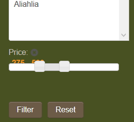
Cursor filter module display wrong

  • Posts: 20
  • Thank you received: 0
9 years 10 months ago #184587

-- HikaShop version -- : 2.3.5

the display has the values behind the selection slider.
I looked on the administrator/components/com_hikashop/classes/filter.php file but I could not find a section to configure the display.

maybe there is a css override?

see attached


Attachments:

Please Log in or Create an account to join the conversation.

  • Posts: 2143
  • Thank you received: 747
9 years 10 months ago #184590

Hi,

Without a link to your site it's hardly possible to say more, but it does look as if it's coming from your template. However, it can be fixed per CSS, indeed.

Just in case, some helpful documentation for you to get started: www.hikashop.com/support/support/documen...ize-the-display.html


Need help with customisations of layouts, style or other site development? PM me!
(Don't forget to turn on "E-mail notification of new messages" )

Please Log in or Create an account to join the conversation.

  • Posts: 20
  • Thank you received: 0
9 years 10 months ago #184593

I would love to link the site, but it is a private password protected site. Member sales wholesale.

Your most likely correct, it very well may be the template. joomla templates are awful "buggy" especially with extensions.


I did not think to use firebug, (smack myself on the forehead....)
and I was just using the developer tools yesterday!
I got to opening the source files in an editor, and that is were my brain stuck.
thanks! I shall try.

Since you seem to be online and uber-active on this forum..
Have you tried the hika shop styles add-on?
I was sadly disappointed when it was not in the business edition..

Please Log in or Create an account to join the conversation.

  • Posts: 2143
  • Thank you received: 747
9 years 10 months ago #184594

coop9653 wrote: Have you tried the hika shop styles add-on?


Nope, not even considered. From what I understand and saw in the description (and still remember now), it's variations in colours and few other display details for the users not so fit in frontend design and customisation or wanting a quick "out of the box" solution, and for those it may well make sense, but I guess I'm not part of these groups.

AFAIK, there's no indication anywhere that these styles could be bundled with anything else. So, not sure why you thought they were part of the Business Edition... :unsure:


Need help with customisations of layouts, style or other site development? PM me!
(Don't forget to turn on "E-mail notification of new messages" )

Please Log in or Create an account to join the conversation.

  • Posts: 20
  • Thank you received: 0
9 years 10 months ago #184596

I did not actually think it would be part of it...
I just read the text on the button that said..."with all the best features" and paid for it.

Honestly, the price was so low, I would of felt guilty getting the cheaper version.

Please Log in or Create an account to join the conversation.

  • Posts: 82865
  • Thank you received: 13372
  • MODERATOR
9 years 10 months ago #184671

Hi,

If you need our help with the cursor display, you can send us a contact request with an access, a link to the page and a link to this thread and we'll look at it:
www.hikashop.com/support/contact-us.html

Please Log in or Create an account to join the conversation.

  • Posts: 82865
  • Thank you received: 13372
  • MODERATOR
9 years 10 months ago #184697

Hi,

Thank you for the access.
It indeed comes from the CSS of the template.
Add that CSS on your website and it will counter the effects of the CSS of the template and the cursor will display properly:
.hikashop_filter_cursor_span{ float: none !important; }

Please Log in or Create an account to join the conversation.

  • Posts: 134
  • Thank you received: 6
9 years 9 months ago #189049

Hi, nicolas,

I have similar problem, displaying cursor filter. The solution that you gave is not effective to me.
The site Url is madein-bg.com/bg/online-store

Please Help!
Thank You

Please Log in or Create an account to join the conversation.

  • Posts: 134
  • Thank you received: 6
9 years 9 months ago #189061

Or... it is better after CSS fix, but how could I remove the colon

(:)
, that is rendered at new line?

Last edit: 9 years 9 months ago by filiar.

Please Log in or Create an account to join the conversation.

  • Posts: 82865
  • Thank you received: 13372
  • MODERATOR
9 years 9 months ago #189063

Hi,

I checked your website but you don't have the same problem so it's normal that this code change doesn't do anything.
On the website of @coop9653 the cursor and the selected range text were displayed one on top of the other.
On your website, there is no such issue as far as I can see. I actually don't see any problem.
You must have configured your filter to not display the cursor after the selection has been made (option "deletable" of the filter) and thus it's displaying like it should.

To remove the : you can use a translation override of the translation key : CURSOR_TITLE_SEPARATOR
hikashop.com/download/languages.html#modify

Please Log in or Create an account to join the conversation.

Time to create page: 0.096 seconds
Powered by Kunena Forum