-- HikaShop version -- : 2.4.0
-- Joomla version -- : 3.4.1
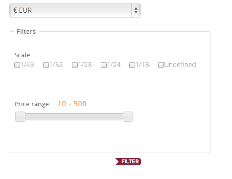
Configuring a new filter module I have some trouble with the most filters appearance which I partially solved checking the forum but I can't find a solution for this:
The checkbox filter is ruled under this CSS I found in the forum
.hikashop_filter_checkbox label{
 display: inline !important;
 padding-right: 8px;
}
The problem is that after 1/24 the next elements should jump to next line otherwise the filter box gets widened outside the template limits.
How can I make the checkbox both inline and using more than one line if needed.
I tried inline-block , removed !important, and something else with no success.
Thank you.
 HIKASHOP ESSENTIAL 60€The basic version. With the main features for a little shop.
 HIKAMARKETAdd-on Create a multivendor platform. Enable many vendors on your website.
 HIKASERIALAdd-on Sale e-tickets, vouchers, gift certificates, serial numbers and more!
 MARKETPLACEPlugins, modules and other kinds of integrations for HikaShop


