Filter button and text not in one line

  • Posts: 102
  • Thank you received: 12
  • Hikashop Business
2 years 7 months ago #340514

-- Joomla version -- : 3.10.6

Hi there,

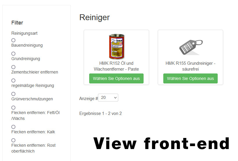
I have created a filter and unfortunately have to realize that the filter buttons are not in line with the text. There is always a line break between button and text (front-end)

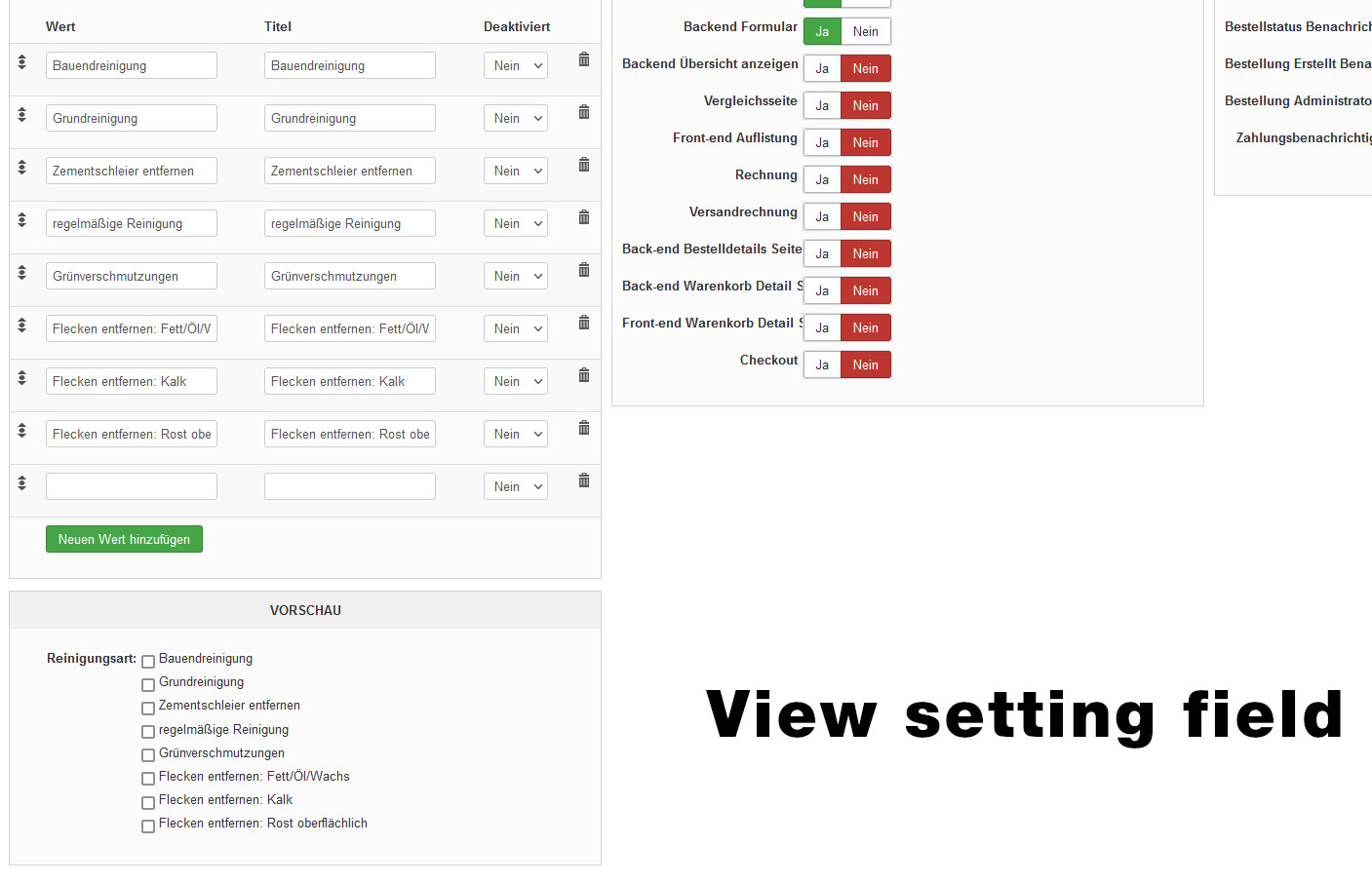
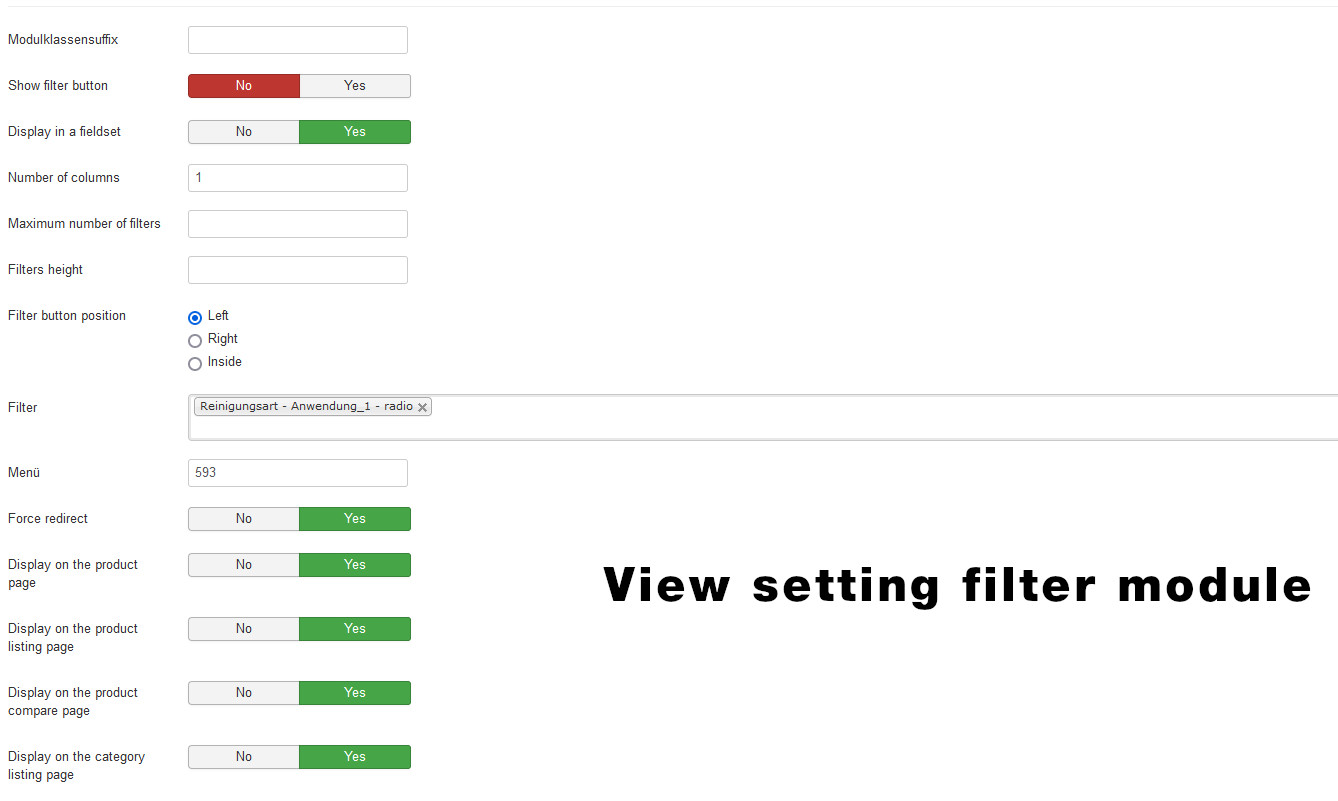
. However, this is correctly displayed in the field settings. What else needs to be set for this?

Thank you in advance for your feedback.

Greetings from Christian

Attachments:

Please Log in or Create an account to join the conversation.

  • Posts: 4747
  • Thank you received: 644
  • MODERATOR
2 years 7 months ago #340517

Hello,

In order to be able to help you, we will need to see by ourselves the context in order to get the root issue.
And so can you provide an Url link to the context, please ?

From this we will now how to help you.
Regards

Last edit: 2 years 7 months ago by Philip.

Please Log in or Create an account to join the conversation.

  • Posts: 102
  • Thank you received: 12
  • Hikashop Business
2 years 7 months ago #340540

Hello,

the link is:
moellerstonecare-shop.de/produkte/hmk-reiniger.html

by the way:
Unfortunately, I also have the problem on this topic that I can assign a maximum of 3 specific selection values ​​for the products in one filter field (7 options are created). For all other filter fields, a variable assignment in the product setting is possible without any problems.

Please Log in or Create an account to join the conversation.

  • Posts: 4747
  • Thank you received: 644
  • MODERATOR
2 years 7 months ago #340549

Hello,

It seems that your display issue come from template, see my screenshot for details :


In order to check this, you can process a test with a default template (like ProtoStar), from this 2 solutions :
- You contact your template provider support
- You add some custom css command (like shown on my screenshot) in order to adjust this point.

Note : Have a look on this documentation to learn how to add css command to your frontend file css.


About your news issue :
"I can assign a maximum of 3 specific selection values ​​for the products in one filter field (7 options are created). For all other filter fields, a variable assignment in the product setting is possible without any problems."
We are really sorry for this returns, but we aren't sure to understand the nature of your problem...
What do you mean by :
"3 specific selection" => Do you mean, filter maximum per 3 filter entries ?
"7 options are created" => Do you mean, that you have create 7 filter entries ?...

In our mind, a filter entry is created in HikaShop, in Main HikaShop Configuration, Display dropdown => Filters.
Awaiting your detailed elements to be sure to understand your point and better help you.

Regards

Last edit: 2 years 7 months ago by Philip.

Please Log in or Create an account to join the conversation.

  • Posts: 102
  • Thank you received: 12
  • Hikashop Business
2 years 7 months ago #340578

Hi there,

thanks for the information. As you described, I changed "display: block;" to "display: inline-block;", unfortunately without any change. The adjustment was made by me as you described in the Hika css area, as well as in the custom.css of the template.
I have captured in the respective css files:
.hikashop_filter_container {display: inline-block;}
But this brought no change. However, I was able to test that I was correct with the css setting filter_values_container, since the input boxes were gone when I entered .filter_values_container {display: none;}.

I also tested it with .hikashop_filter_checkbox {display: inline-block;} in both css, also no change.
Also the css width: 92%; helps not.

I also noticed that the display (filter front-end) in your screenshot differs from the browser view I posted. With me, there is a line break after the check box in different browsers, with you it is in one line.

Regarding the other error message (maximum of 3 specific selection values):
Sorry for this mix up. For this I will create a new topic in which the contents are also better explained.

It would be great if you could give me an alternative suggestion. Thanks in advance.

Last edit: 2 years 7 months ago by chli.

Please Log in or Create an account to join the conversation.

  • Posts: 4747
  • Thank you received: 644
  • MODERATOR
2 years 7 months ago #340593

Hello,

I'm sorry but you didn't follow my instructions correctly, the target of your selector was built to target the label (<label></label>).

By analyzing your css I see that you have targeted several different elements (and in several different situations, container or sub-container) and therefore had to apply the following css commands to them the same commands :

display: inline-block;
    margin-bottom: 5px;
    width: 80%;

And unfortunately in several places (red bordered) except where I indicate in my previous screenshot, namely the "label" (green bordered) so you will now have to go back because indeed with all these modifications my commands can no longer work, see my screenshot to see the places to "clean up", see my screenshot for better understand my idea :


Then, use the commands on the good target, and I will add an important point, add to your selector a specific container class, see my scheme to understand the idea :
.specific_container_class .label {
Your command Css
}

I think that the container class red bordered & with the N°1 has the good class, to restrict your custom command only in your filter context.

Hope this will help you to correct your display issue.
Regards

Last edit: 2 years 7 months ago by Philip.

Please Log in or Create an account to join the conversation.

  • Posts: 102
  • Thank you received: 12
  • Hikashop Business
2 years 7 months ago #340982

Hello Philippe,

Unfortunately, your instructions are very difficult for me to understand because I have to translate them into German and it is not always so understandable.

Currently I have removed the commands from the css template:

.filter_values_container {display: inline-block; margin-bottom: 5px; width: 80%;}
.hikashop_filter_checkbox { display: inline-block; margin-bottom: 5px; width: 80%;}

Perhaps you could tell me more precisely where the corresponding adjustments should be made in the hika-css or the template-css.

Thanks in advance.

Please Log in or Create an account to join the conversation.

  • Posts: 2143
  • Thank you received: 747
2 years 7 months ago #340989

Hallo "chli",

ich erlaube mir mal, mich hier einzuklinken, damit es einerseits sprachlich einfacher für dich ist, und andererseits, um dir die Lösung zu geben.

Die folgenden Zeilen setzt du am besten entweder ans Ende deines HikaShop Custom CSS oder ans Ende deines Template Custom CSS -- je nachdem, wie es dir leichter fällt:

.hikashop_filter_checkbox {
    display: block;
}
.hikashop_filter_checkbox > input[type="radio"], .hikashop_filter_checkbox > input[type="checkbox"] {
    margin: -2px 5px 0 0;
}
.hikashop_filter_checkbox > label {
    display: inline;
}

Dann sollte es so aussehen, wie du es willst.


Need help with customisations of layouts, style or other site development? PM me!
(Don't forget to turn on "E-mail notification of new messages" )
Last edit: 2 years 7 months ago by lousyfool. Reason: Korrektur:.hikashop_filter_checkbox {display: block;}
The following user(s) said Thank You: Philip

Please Log in or Create an account to join the conversation.

  • Posts: 4747
  • Thank you received: 644
  • MODERATOR
2 years 7 months ago #340983

Hello,

In this link to the documenation , and note that you can add your command Css in HikaShop frontend.css OR style.css or any Css file.
In general, it doesn't matter where you put your css commands, what really matters is the priority you give your css commands.

Here some explanations to understand how to build high priority css command :
1. First the minimum necessary to function properly :
Check that your selector is well written, good class (or Id) html and no mistake or typo
If your command is visible in your browser inspector tool, but is overridden (css command crossed out), then his priority isn't strong enough.


2. Now, some css priority system explanation :
From less to the highest priority :
.html_class_element {command: value}
.html_class_module .html_class_element {command: value}
.html_class_page .html_class_module .html_class_element {command: value}
.html_class_page .html_class_module .html_class_element {command: value !important;}


Note, that if 2 css commands have strictly the same selector, then the last written in the css file will be the one used.
Hope this will help you to achieve what you need.

Regards

Last edit: 2 years 7 months ago by Philip.

Please Log in or Create an account to join the conversation.

  • Posts: 102
  • Thank you received: 12
  • Hikashop Business
2 years 7 months ago #341025

Hallo lousyfool,

vielen Dank für das "einmischen", Code funktioniert wunderbar.

Please Log in or Create an account to join the conversation.

Time to create page: 0.100 seconds
Powered by Kunena Forum