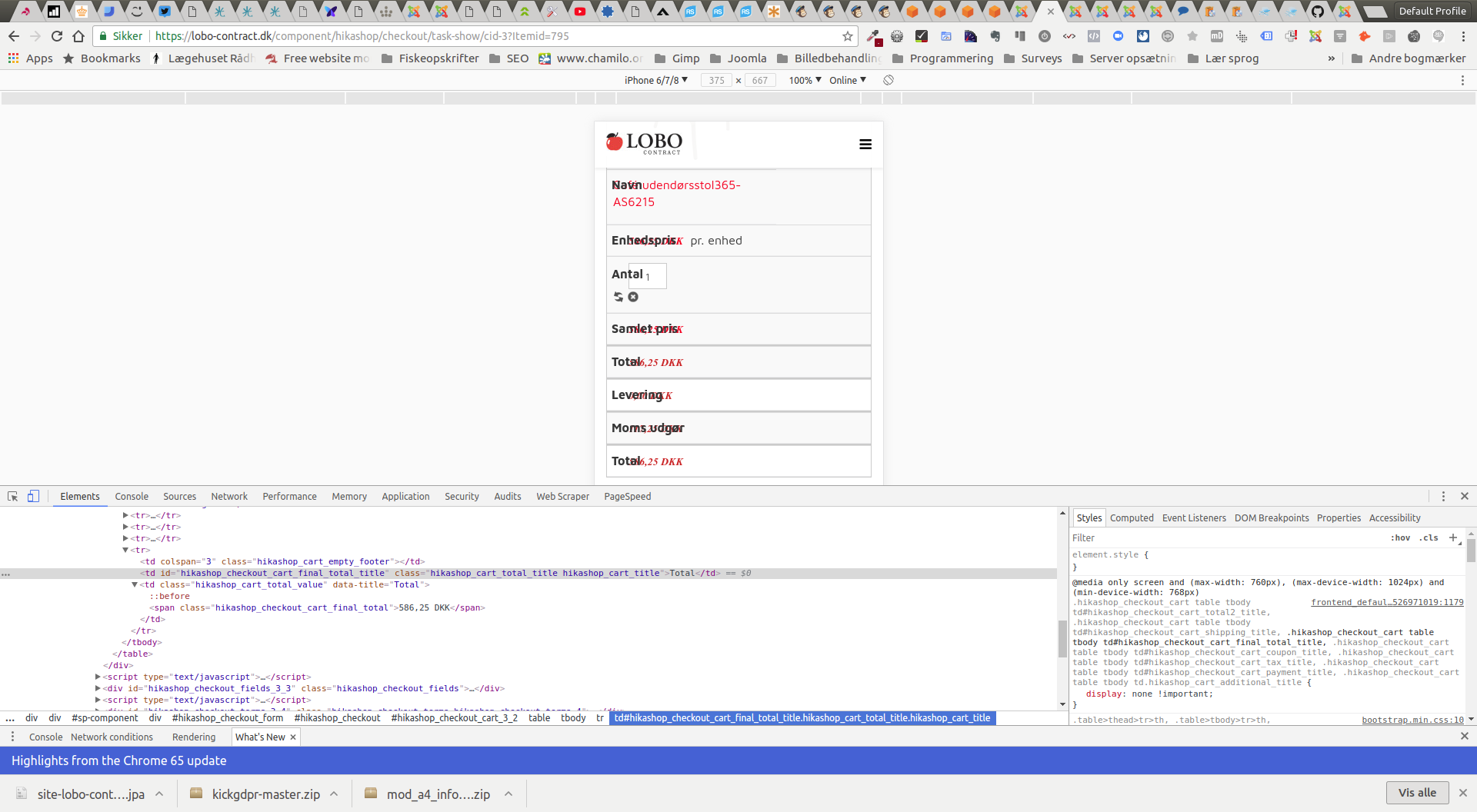
Hello,
Ok I get it, thanks for your return, the issue is works with Boot Strap that add some Css.
I will guide you to edit your Frontend Css file in order to correct this :
1°) If you don't how to edit the frontend css file, read
this tutorial
.
2°) Go to around line 830, and find this code :
.hikashop_show_cart_form td.hikashop_cart_product_name_value {width: 64%} And comment this line or remove it as you want.
3°) Go to around line
1305, and find this code :
.hikashop_checkout_cart table td {
		min-height: 25px;
		border: none;
		border-bottom: 1px solid #eee;
		position: relative;
		padding-left: 30%;
} Add an
!important to the
padding-left: 30%;
On our side, we have add this correction to our Frontend Css file, for next release.
Regards
 HIKASHOP ESSENTIAL 60€The basic version. With the main features for a little shop.
 HIKAMARKETAdd-on Create a multivendor platform. Enable many vendors on your website.
 HIKASERIALAdd-on Sale e-tickets, vouchers, gift certificates, serial numbers and more!
 MARKETPLACEPlugins, modules and other kinds of integrations for HikaShop


