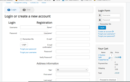
Hi,
1. Regarding the login/registration areas overlapping, it comes from your template CSS which has a big width for the input fields, while having a small width for the overhaul width of the page, and the modules on the right sidebar, eating up some of the width available.
There are several ways to solve that:
- modify the CSS / options of your template to increase the width of the page (you might want to ask your template provider).
- configure the "menu assignment" of your right sidebar modules to not appear on the checkout pages. You'll need to first create a menu item of the type HikaShop checkout, and then select it in the "force a menu on checkout" setting of the HikaShop configuration so that you can unassign it in your modules.
- add custom CSS to reduce the width of the input boxes
- turn off the "login" setting of the Checkout tab in the HikaShop configuration so that you only get the "registration" area since you already have the login form on the right sidebar
- upgrade your HikaShop to a commercial edition and configure the settings under the checkout tab of the Hikashop configuration to have a selector between the login form and the registration like on our demo website:
i.imgur.com/Q39PEcG.png
2. You can add such CSS:
.hikashop_cart_module_shipping_value { white-space: nowrap; }
www.hikashop.com/support/documentation/1...ize-the-display.html
3. If you want to remove the "payment fee" row from the cart module, you can edit the cart module settings in the Joomla modules manager, and turn off the payment display setting.
 HIKASHOP ESSENTIAL 60€The basic version. With the main features for a little shop.
 HIKAMARKETAdd-on Create a multivendor platform. Enable many vendors on your website.
 HIKASERIALAdd-on Sale e-tickets, vouchers, gift certificates, serial numbers and more!
 MARKETPLACEPlugins, modules and other kinds of integrations for HikaShop


