Hi thefbi,
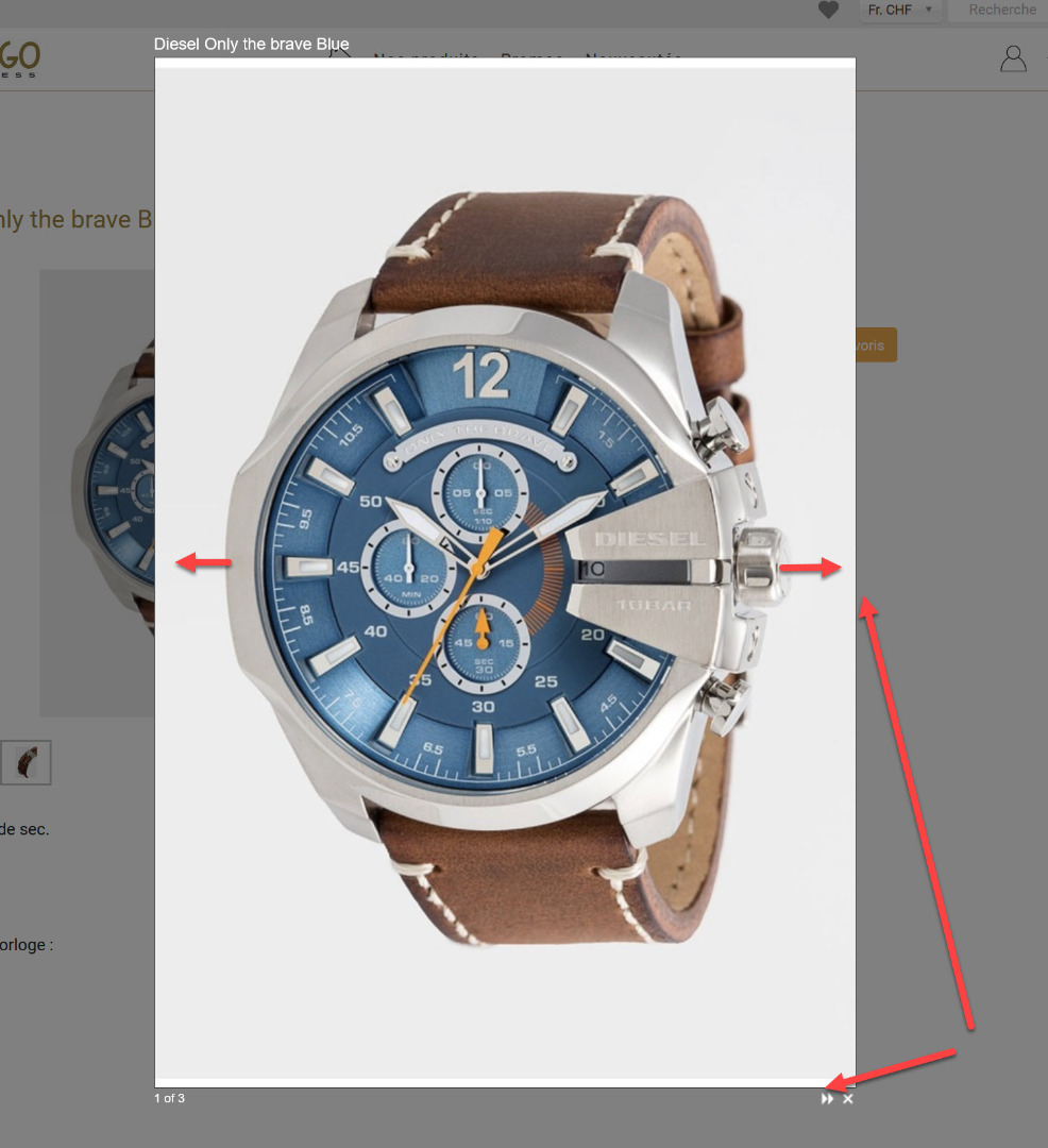
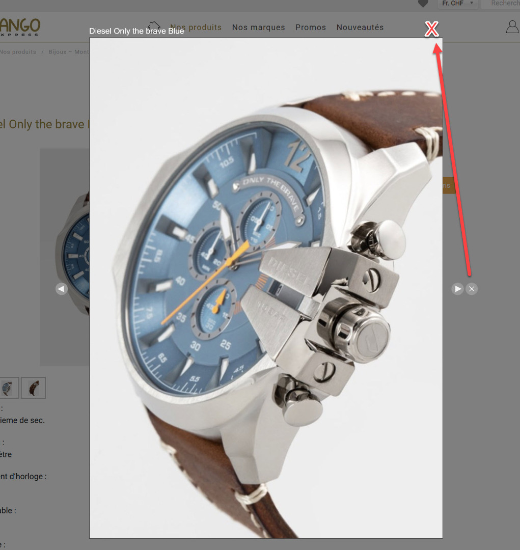
If you want to keep using the ShadowBox popup, here below is a CSS solution which replaces the background images with FontAwesome icons and makes everything larger, so that users have it easier:
#sb-info, #sb-info-inner {
	height: 36px;
	line-height: 36px;
}
#sb-counter {
	font-size: 16px;
	font-weight: bold;
}
#sb-nav {
	height: 36px;
}
#sb-nav a {
	font-family: "Font Awesome 5 Free";
	text-decoration: none;
	color: #fff;
	text-align: center;
	font-size: 24px;
	height: 36px;
	width: 36px;
	margin-left: 5px;
	line-height: 36px;
}
#sb-nav-close, #sb-nav-next, #sb-nav-play, #sb-nav-pause, #sb-nav-previous {
	background-image: none;
}
a#sb-nav-close {
	font-size: 29px;
	margin-left: 15px;
}
#sb-nav-close:before {
	content: "\f00d";
}
#sb-nav-next:before {
	content: "\f04e";
}
#sb-nav-play:before {
	content: "\f04b";
}
#sb-nav-pause:before {
	content: "\f04c";
}
#sb-nav-previous:before {
	content: "\f04a";
}
Adjust to your needs or taste, of course.
E.g., the font "Font Awesome 5 Free" comes with HikaShop by default, but depending on your specific setup you might need to use "FontAwesome" or similar instead.
Result of above code in my case:
 HIKASHOP ESSENTIAL 60€The basic version. With the main features for a little shop.
 HIKAMARKETAdd-on Create a multivendor platform. Enable many vendors on your website.
 HIKASERIALAdd-on Sale e-tickets, vouchers, gift certificates, serial numbers and more!
 MARKETPLACEPlugins, modules and other kinds of integrations for HikaShop


