Slight modification to layout of user points

  • Posts: 208
  • Thank you received: 10
10 years 9 months ago #145826

-- url of the page with the problem -- : mywebsite.com/mypage
-- HikaShop version -- : 2.30 Essential
-- Joomla version -- : x.x
-- PHP version -- : x.x.x
-- Browser(s) name and version -- : XXXXX x.x.x
-- Error-message(debug-mod must be tuned on) -- : Error_message

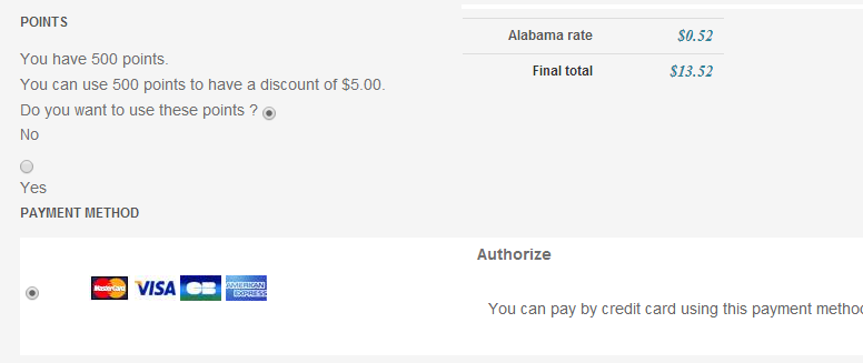
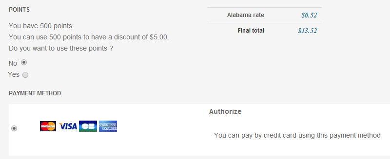
Currently, on the checkout page for the alphauser points...the layout for the radio buttons are not in the right place. It's not confusing for me, but it might be for customers. In this screenshot, notice the radio button for NO is not lined up...neither for YES


How can I alter any of the code to get it to look like this (with the radio buttons lined up correctly?

Attachments:
Last edit: 10 years 9 months ago by simmiepam. Reason: Wrong image

Please Log in or Create an account to join the conversation.

  • Posts: 12953
  • Thank you received: 1778
10 years 9 months ago #145836

Hi,
I think that using some CSS code will probably do the job :).

Please Log in or Create an account to join the conversation.

  • Posts: 208
  • Thank you received: 10
10 years 9 months ago #145947

Thank you

I inspected the element and found that the section I need to alter is in the
hikashop_checkout_cart

In that cart, the section that I need to alter is
hikashop_userpoint_status

I went to the view of...

Checkout > cart

and looked for the section for Hikashop_userpoint status and could not find it.

Is that the right view? Checkout, cart or should I be looking elsewhere?

Please Log in or Create an account to join the conversation.

  • Posts: 82868
  • Thank you received: 13376
  • MODERATOR
10 years 9 months ago #145989

You can add your custom CSS code in the frontend CSS file of HikaShop that you can edit in the Display tab of the configuration, as explained in the documentation link provided by Mohamed.

The Views management area where you went is to modify the HTML/PHP code of the views of HikaShop, which is not necessary for what you want to do.

Please Log in or Create an account to join the conversation.

  • Posts: 208
  • Thank you received: 10
10 years 8 months ago #146207

Thanks Nicolas

Except when I go to the front-end custom .css

I don't see anything about the Points section where I can make any changes.

I see this about payments, but nothing where I tell the system to make the radio button next to the word "No" and not above it

.hikashop_checkout_payment_description{color:#666}
.hikashop_checkout_cart_shipping{color:#2C8296; font-style:italic; font-family:"Times New Roman", Times, serif; font-size:14px}

#hikashop_payment_methods table {border-collapse:collapse; width:100%}
.hikashop_checkout_payment_description{margin-left:10px}
#hikashop_payment_methods td {padding:5px; background-color:#fff}
#hikashop_payment_methods .row0:hover, #hikashop_payment_methods .row1:hover{background-color:#f8f8f8}

#hikashop_payment_methods .hikashop_credit_card td{background-color:#f8f8f8}
#hikashop_checkout_cart table{border-collapse:collapse}

Please Log in or Create an account to join the conversation.

  • Posts: 26158
  • Thank you received: 4028
  • MODERATOR
10 years 8 months ago #146394

Hi,

There is currently no CSS for the user points section in the HikaShop checkout.
But the HTML generated by the plugin have specific id/class that you can use to create your specific CSS rules.

I will recommend you to read (once more) our documentation about the customization of the display.
We can provide a support for HikaShop, how to use it and configure it but we can't provide such customization support for our users. We are more developers than designers, we are not specialized in it and like we can't provide PHP custom development, we can't provide CSS custom designs through this forum.

Thanks for your understanding.

Regards,


Jerome - Obsidev.com
HikaMarket & HikaSerial developer / HikaShop core dev team.

Also helping the HikaShop support team when having some time or couldn't sleep.
By the way, do not send me private message, use the "contact us" form instead.

Please Log in or Create an account to join the conversation.

  • Posts: 208
  • Thank you received: 10
10 years 8 months ago #146405

I understand....

It would be so great, though, if that would be fixed maybe in upcoming versions...because it really looks odd the way it is and kinda unprofessional.

I love the application!

Thanks
Pam

Please Log in or Create an account to join the conversation.

  • Posts: 2334
  • Thank you received: 403
10 years 8 months ago #146807

Hi Pam,

As said Jerome, there is no css on this, but it should work by default.
If you have a display issue, it mights come from your own template and css. So there is not much to add on our end.
Anyway, did you solved your issue? If not, feel free to post a link to your page here so we can take a look at it and help you fix this ;)

Please Log in or Create an account to join the conversation.

  • Posts: 208
  • Thank you received: 10
10 years 5 months ago #160134

Thanks Elliot

Nope, as of today...I still cannot figure out how to make the radio button line up with the words. It looks so unprofessional!

www.BestederNewsletters.com is my site.

I tried to inspect the element with Firebug...was able to locate the area, used the option to edit with HTML (I know some about it)...but it didn't save what I changed there in Firebug. So I'm at a loss as to where in my system to alter that HTML so it can save.

Thanks
Pam

Please Log in or Create an account to join the conversation.

  • Posts: 26158
  • Thank you received: 4028
  • MODERATOR
10 years 5 months ago #160425

Hi,

You don't have to change the HTML, you have to add some new CSS rules.
Modifying the HTML won't be useful because you won't be able to modify it in the HikaShop plugin afterwards.
So you really have to find the CSS rules which add the problem.
Like a "display:block" on input radio or on labels.

Regards,


Jerome - Obsidev.com
HikaMarket & HikaSerial developer / HikaShop core dev team.

Also helping the HikaShop support team when having some time or couldn't sleep.
By the way, do not send me private message, use the "contact us" form instead.

Please Log in or Create an account to join the conversation.

Time to create page: 0.105 seconds
Powered by Kunena Forum