HikaShop eWay Rapid payment plugin problems

  • Posts: 22
  • Thank you received: 2
5 years 7 months ago #305477

-- url of the page with the problem -- : quollbooks.comau/hikashop-menu-for-products-listing
-- HikaShop version -- : 4.0.3
-- Joomla version -- : 3.9.4
-- PHP version -- : 7.2.16
-- Browser(s) name and version -- : Microsoft Edge 42.17134.1.0

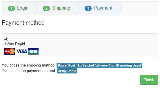
  • I have configured HikaShop for a three stage process: Login > Shipping > Payment. The first two stages work well with the Shipping page ending with a [Next] button at the bottom. Clicking the [Next] button shows this page:


    There are some problems with this page:
    1. The button at the bottom is labelled [Finish] but the payment process is not finished - no credit card details have been entered at this stage. Labelling the button "Finish" is confusing to users. Could it be changed to "Next"?
    2. Our site is currently configured with only one payment method - credit card payment - so this step is not necessary at all. Could this step be omitted unless two or more payment methods are offered to users?

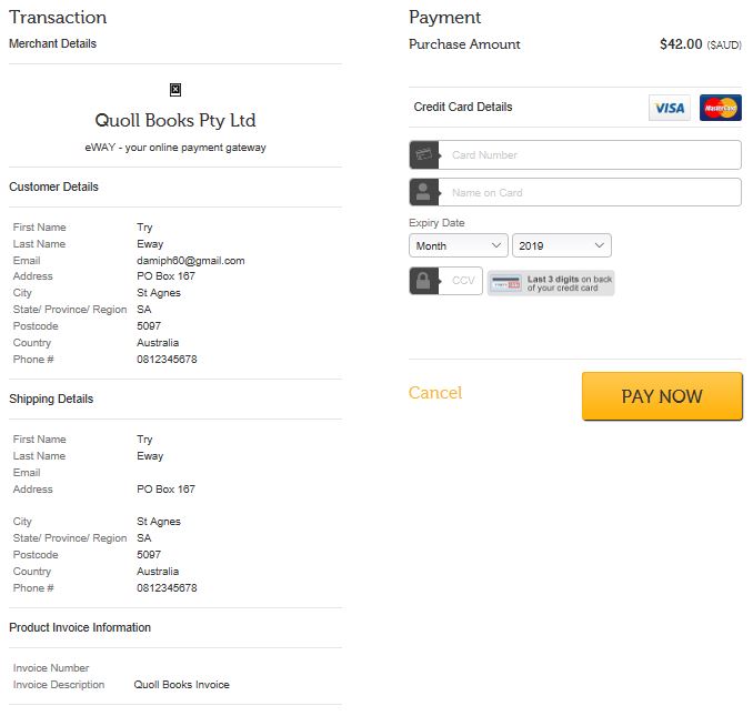
    Clicking the [Finish] button (that would be better labelled a [Next] button) shows this page:


    I have configured the eWay Rapid plugin so that the customer and shipping details are read-only. However, the presentation of this information as a table wrongly suggests to the user that it can be edited. And it distracts attention from the main purpose of this page: to enter credit card details. It is common practice on other sites to list customer details as an "'address block", such as:
    Mr Try Eway
    PO Box 167
    St Agnes SA 5097 Australia
    Could that be done, with an Edit button added when configured for editing by the user?

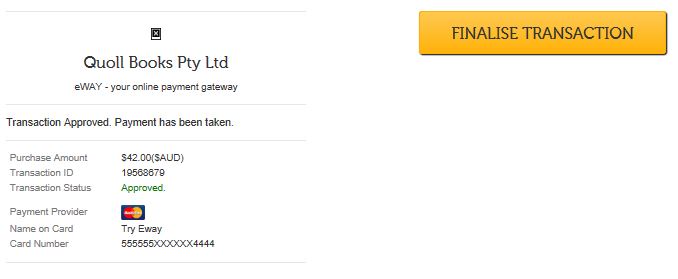
    When the credit card details are added and the [PAY NOW] button is pressed, the user would expect to be transferred to another page listing the goods ordered, the cost of the goods, the payment received and advice that the balance owing is zero - in other words an invoice/receipt. However the following page does not contain this information - it is like this:


    On the left, this page says: "Transaction Approved. Payment has been taken." However testing shows that the payment has NOT been taken at this stage. The label on the button (at the top right), namely "FINALISE TRANSACTION" is again misleading. The fact that the button on the previous page was labelled "PAY NOW" suggests to the user that clicking that button is the step that makes the payment - but it doesn't. Users may read the message "Transaction Approved. Payment has been taken.", assume that no further actions are required and ignore the [FINALISE TRANSACTION] button. The result is that no order is generated and no payment is made.

    Can this be fixed by repacing this page with an invoice/receipt page, as described above?

    A further problem is that the payment process results in HikaShop generating two emails:
    - one saying that an order has been created - pay now,
    - another saying that an order has been completed.

    Our website accepts only one payment method - payment by credit card. The first email is confusing - the "pay now" email may be read by the user AFTER the payment has been made. Can HikaShop be configured so that, when a credit card payment is completed as the final step in the payment process (as in our case), the first email (order created - "pay now") is NOT sent? In this case only the second email (order completed) is needed.

    I hope these issues can be addressed so that the payment process is much more user-friendly.

Attachments:

Please Log in or Create an account to join the conversation.

  • Posts: 82863
  • Thank you received: 13372
  • MODERATOR
5 years 7 months ago #305481

Hi,

1. You can use a translation override to change that text, like for any text of the interface of HikaShop/Joomla:
www.hikashop.com/download/languages.html#modify

2. For now, you could add CSS to hide that area.
www.hikashop.com/support/documentation/1...ize-the-display.html

3. Once you click on the "finish" button of the HikaShop checkout, you go to the payment gateway payment pages.
So if you want to customize the views of your last two screenshots, you need to contact the support of eWay and see with them what can be done. Some payment gateways offer customization of these pages via templating that can be configured on the merchant account some don't. If they don't, I'm afraid you'll be stuck with that presentation unless you use another payment gateway.

4. If you don't want the first email, you can just disable it via the menu System>Emails of the HikaShop backend. It is called "order creation notification".

Please Log in or Create an account to join the conversation.

  • Posts: 22
  • Thank you received: 2
5 years 7 months ago #305519

Thank you for your answers, which have enabled me to make progress on those pages controlled by HikaShop. I will seek to address the issues with the eWAY pages with eWAY.

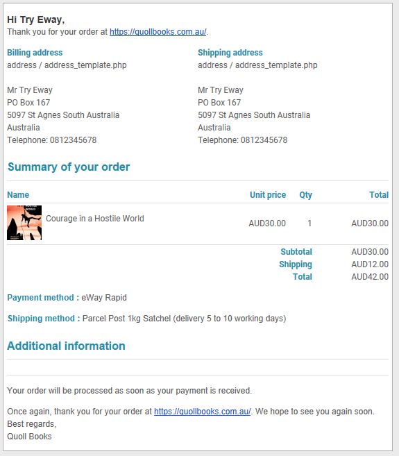
In the HikaShop eWay Rapid payment plugin there is a field for Return url. When an order is successfully completed, is it possible to return a website page (normally not publicly visible) that contains information similar to that in the order confirmation email (example shown below)?

Attachments:

Please Log in or Create an account to join the conversation.

  • Posts: 82863
  • Thank you received: 13372
  • MODERATOR
5 years 7 months ago #305522

Hi,

Normally, if you don't enter anything in that return URL, you should be directed to a "thank you" page with a message including a link to the order details page displaying the information as you want.
So it's already pretty close to what you want.
Now, if you want to get that order details page directly, it's possible with the "return URL" parameter of the payment method.
However, as the order_id in the URL is dynamic, you'll need to add tags to the return URL.
So for example, suppose that the URL to the order details page is mywebsite.com/orders/order/cid-XXX where XXX is the id of the order, you'll want to enter the URL

http://mywebsite.com/orders/order/cid-{order_id}
in that return URL parameter.
For guest checkout (if you have it activated), you also need the order_token parameter which is also different for each order and thus you should use {order_token} in the return URL.

Last edit: 5 years 7 months ago by nicolas.

Please Log in or Create an account to join the conversation.

  • Posts: 22
  • Thank you received: 2
5 years 7 months ago #305563

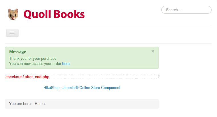
Thanks again. As you say, if the Return URL field is left blank, the eWay Rapid payment plugin returns the user (on our site) to this "thank-you" page (with codes turned on):


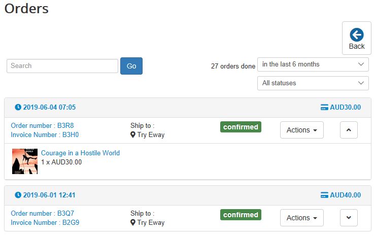
Clicking on the "here" link shows the relevant order page, which does indeed provide the user with information about their order. This is what I wanted, but the additional click required is not as user-friendly as I would like.

I tried following your instructions and entered in the Return URL field this URL:
quollbooks.com.au/component/hikashop/order/show/cid-{order_id }
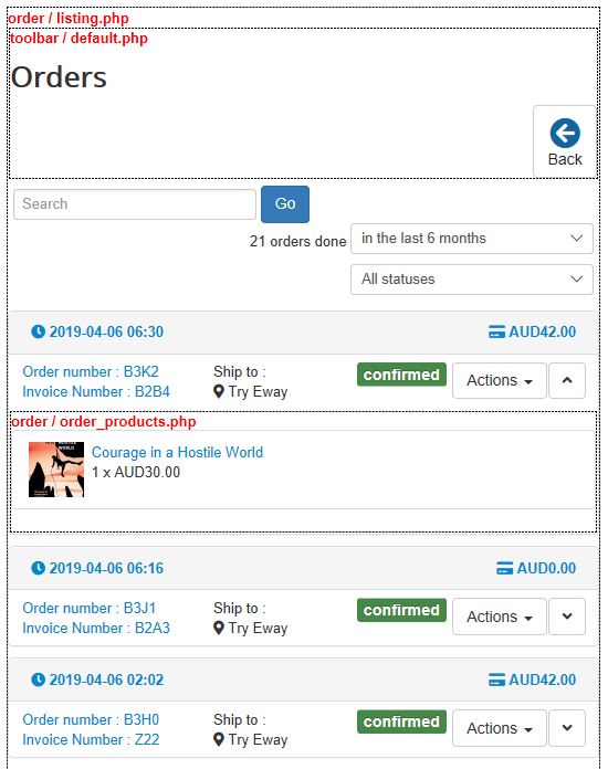
This resulted in the display of an order-listing page, not the individual order concerned:


Hence I have some questions.

1. To display the details of a single order, is a different tag required (i.e. not {order_id })?

2. Could the order information be shown on the thank-you page, rather than on another page accessed by a link?

3. The order page itself has a "Back" button, which does NOT return the user to the "thank-you" page. Instead it takes the user to a page listing previous orders on this site. Could the "Back" button be removed, so that only the relevant order page is accessed?

Attachments:

Please Log in or Create an account to join the conversation.

  • Posts: 82863
  • Thank you received: 13372
  • MODERATOR
5 years 7 months ago #305600

Hi,

1. Sorry for that, it's {order_id} without any space. The forum system we use actually added that space when creating the a tag around the link I gave in my message. I've modified my message to add [ code ] tags around the link so that the correct link is displayed in my previous message.
If you use that link with the tag {order_id} correctly written, it will display the order details page.

2. It could. If you edit the view checkout/after_end.php via the menu Display>Views, you can find all the information of the order in $this->order. However, it will be a lot of work instead of just redirecting the customer to the order details page.

3. This depends on the current menu item. If the current menu item is a user control panel or orders listing menu item type, then the back button will display. If the menu item is of another type, it won't display. So it actually depends on the link you're using to access the order details page.

Please Log in or Create an account to join the conversation.

  • Posts: 22
  • Thank you received: 2
5 years 7 months ago #305789

Thanks for your clarifications. I think I'll go with the default (blank field) for now - although, if the user clicks the link to view the order form, the [Back] button remains a problem.

Please Log in or Create an account to join the conversation.

  • Posts: 82863
  • Thank you received: 13372
  • MODERATOR
5 years 7 months ago #305807

Hi,

You should be able to not have the back button. As I said, it depends on the link you're using and what menu item alias you have in the link. Also, you could simply hide that button with CSS if you don't want it.

Please Log in or Create an account to join the conversation.

  • Posts: 22
  • Thank you received: 2
5 years 5 months ago #307236

Hi,

I'm sorry but I'm still confused about the Back button on the Order details page.

After processing an order, the website returns to the URL:
quollbooks.com.au/index.php?option=com_h...order_token=KSYAUonX
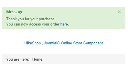
and displays the following message:


When I click the "here" link to access the order details, the website shows this URL:
quollbooks.com.au/component/hikashop/order/show/cid-38
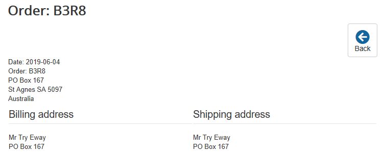
and displays the following page:

This page includes a Back button.

The average user would expect the Back button to return the user to the previous page:

But it doesn't.

Instead, the user is returned to the Orders List URL:
quollbooks.com.au/component/hikashop/order
and displays the following page:


After processing an order (using the eWAY payment gateway), the HikaShop standard default behaviour is to return the user to the "Thank you for your purchase" page. The user is invited to click on the (standard) "here" link to access the order details, which then shows a page with a Back button. You have said that the behavour of this Back button depends on how the page is reached. Can't the HikaShop code be changed to recognise that, when the Order details page is reached from the standard "Thank you for your purchase" page, the Back button returns the user to the "Thank you for your purchase" page?

Attachments:

Please Log in or Create an account to join the conversation.

  • Posts: 82863
  • Thank you received: 13372
  • MODERATOR
5 years 5 months ago #307238

Hi,

Thank you for your feedback. We'll work on improving the display of the back button or not based on where the user access the order page. There is already something for some pages, but it's not handled for the link on the thank you page so far.
I personally believe that if you access the order page from the link on the thank you page, you don't want the back button at all. But you want it when you access it from the orders listing or the user control panel.

The following user(s) said Thank You: usyuse

Please Log in or Create an account to join the conversation.

  • Posts: 7
  • Thank you received: 1
5 years 5 months ago #307327

hello nicolas
thank you and hope you find a solution very soon.
while working on the back button, please work on the url and other buttons too.
1. when I purchase a product and cart module pops up, and I press the proceed to checkout
2. or when I'm in the cart, and I press checkout, it redirects to the url:

myweb.com/index.php/component/hikashop/checkout?Itemid=146.

problem number 1 SOMETIMES happens and I don't know when.
problem number 2 ALWAYS happens.

I have created a separate menu for hikashop checkout : myweb.com/pay

but I don't know why it doesn't always redirects to it.

thanks.

Please Log in or Create an account to join the conversation.

  • Posts: 22
  • Thank you received: 2
5 years 5 months ago #307342

Thanks Nicolas.

I'm inclined to agreed with you that the Back button may not be needed at all. You have suggested previously that the file could be edited to remove (or hide) the Back button, but I'm not confident with PHP or CSS (and I'm not sure I remember how to find the file to edit it).

Another matter I have just realised is that the URL reached from the thankyou page: quollbooks.com.au/component/hikashop/order/show/cid-38
is different from the URL reached on my website from the "Your Orders" page in the User Menu I have configured:
quollbooks.com.au/your-orders/order/show/cid-38
I'm not sure how this works, but I presume my "custom" URL points to the same place as the "generic" URL.

Please Log in or Create an account to join the conversation.

  • Posts: 82863
  • Thank you received: 13372
  • MODERATOR
5 years 5 months ago #307365

Hi,

@usyuse:
To me it sounds like you didn't select your checkout menu item in the "force menu on checkout" setting of the HikaShop configuration. If you do that, you should always go to the correct menu item that you selected there.

@damihyph:
The modifications to handle properly the back button will be added in the next version of HikaShop. So you'll get them when you update without doing anything. I would recommend to wait for that if you're not confident with PHP. If nevertheless you want to modify the code to handle that as you want, you can see which view file to edit by activating temporarily the "Display view files" setting of the HikaShop configuration and then editing the view via the menu Display>Views.
Regarding the URL, it's normal that it is different. On the thank you page, you are on a certain menu item. And on the orders listing, you are on another menu item, so the alias of the menu item used in the URL is different. And if the menu item on the thank you page is not a HikaShop menu item, then the alias becomes "component/hikashop" so that it directs to HikaShop for the display.
Now we could potentially do something to search for menu items of the type orders listing, or of the type user control panel to use it instead of the current one. Just that it adds processing for not much benefits.

Please Log in or Create an account to join the conversation.

Time to create page: 0.150 seconds
Powered by Kunena Forum