-- url of the page with the problem -- :
www.willowcreekgraphics.com/atproducts/a...-and-mirror-graphics
-- HikaShop version -- : 3.0.1
-- Joomla version -- : 3.6.5
-- PHP version -- : 5.6.29
-- Browser(s) name and version -- : Firefox 51.0.1
-- Error-message(debug-mod must be tuned on) -- : N/A - display issue
I've seen a number of posts discussing inconsistent display of listings but saw nothing applicable, nor a fix for what I'm seeing in the latest version. I have bootstrap enabled and responsive template (Atelier by Favtheme), in configuration using default front-end CSS and Styles.
I downloaded the latest release prior to posting and also confirmed the issue is not specific to my template.
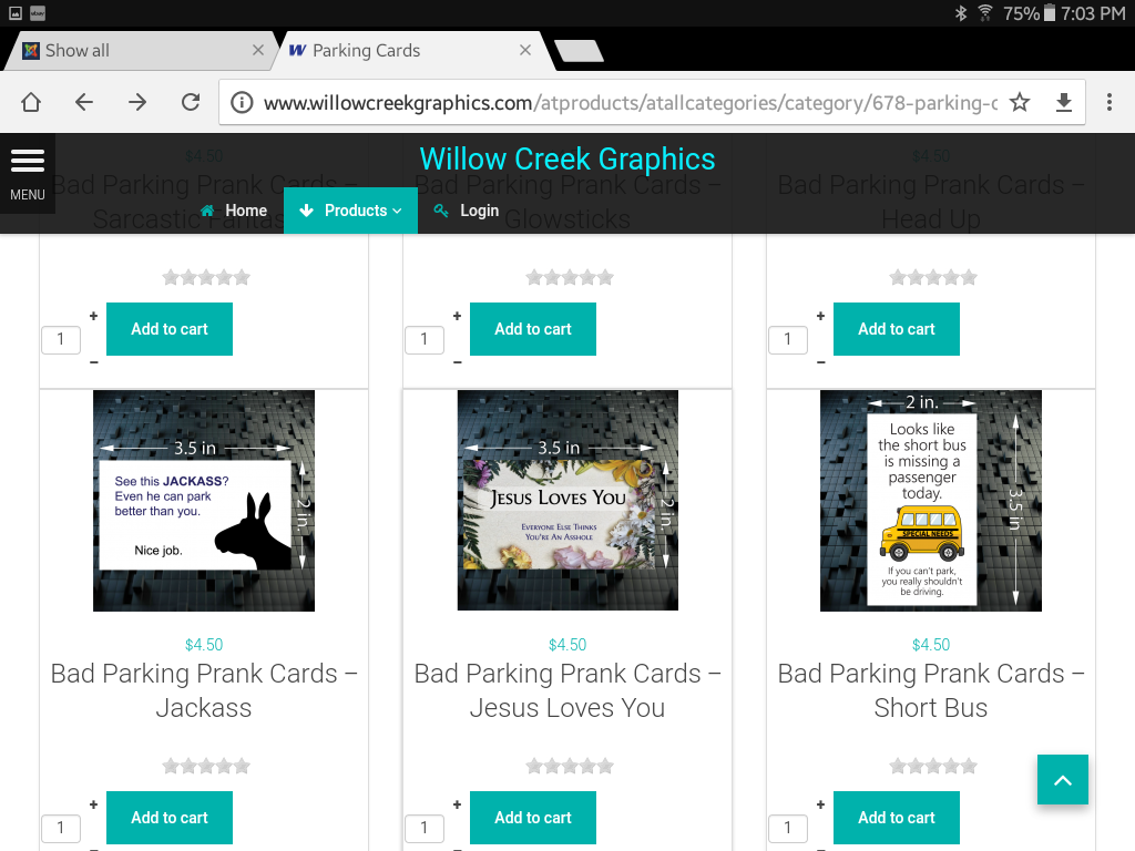
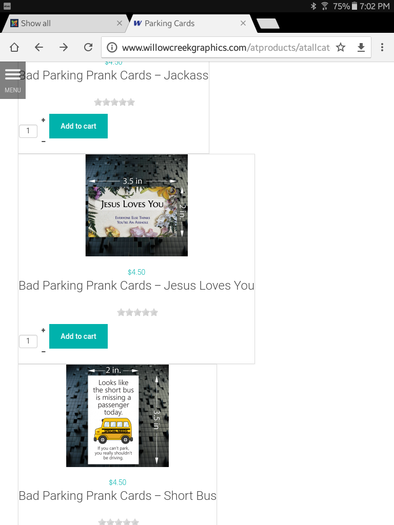
What I'm seeing is jagged displays depending on the width of the device's display. Looks great on a tablet in landscape, ugly in portrait orientation. On a desktop, what I'm seeing is that as the width is reduced, at some point the product description reverts to a single line. For longer descriptions, that forces the container to be wide so on some rows there's one column, two on others and so on.
The first screen landscape attachment shows a wide display with nice, even columns and rows. The second in portrait orientation shows that product descriptions are all a single line so the width varies, as does the number of columns of products.
Is there something else I need to do or look at to have the display be consistent?


 HIKASHOP ESSENTIAL 60€The basic version. With the main features for a little shop.
 HIKAMARKETAdd-on Create a multivendor platform. Enable many vendors on your website.
 HIKASERIALAdd-on Sale e-tickets, vouchers, gift certificates, serial numbers and more!
 MARKETPLACEPlugins, modules and other kinds of integrations for HikaShop

