Image Distortion on mobile Devices

  • Posts: 15
  • Thank you received: 0
6 years 1 month ago #303224

-- url of the page with the problem -- : mbdesigns.co.uk
-- HikaShop version -- : 4.0.2
-- Joomla version -- : 3.9.2
-- PHP version -- : 7.2.13
-- Browser(s) name and version -- : Firefox 65.0, chrome, opera, Edge
-- Error-message(debug-mod must be tuned on) -- : No Error Messages

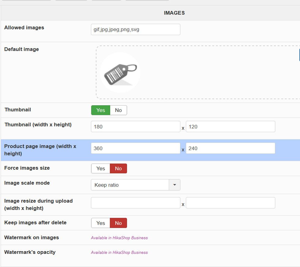
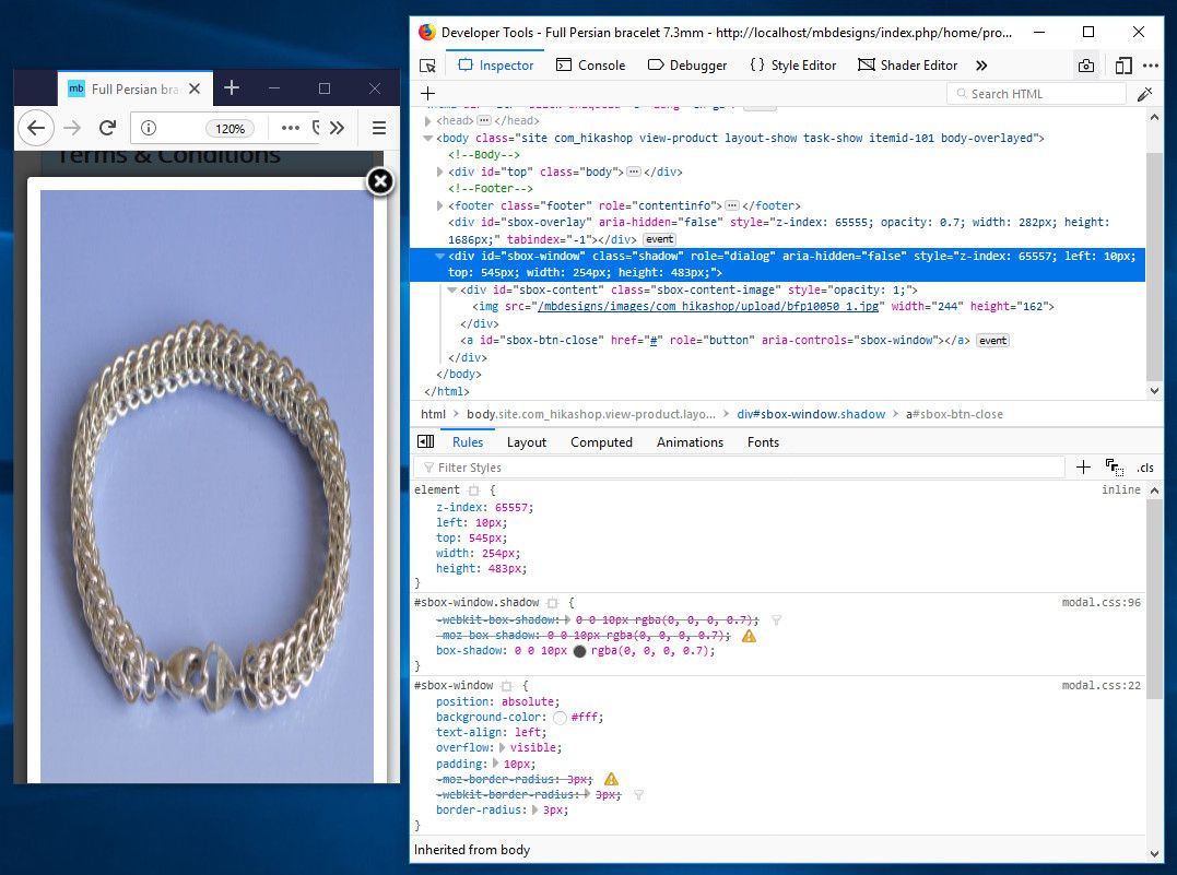
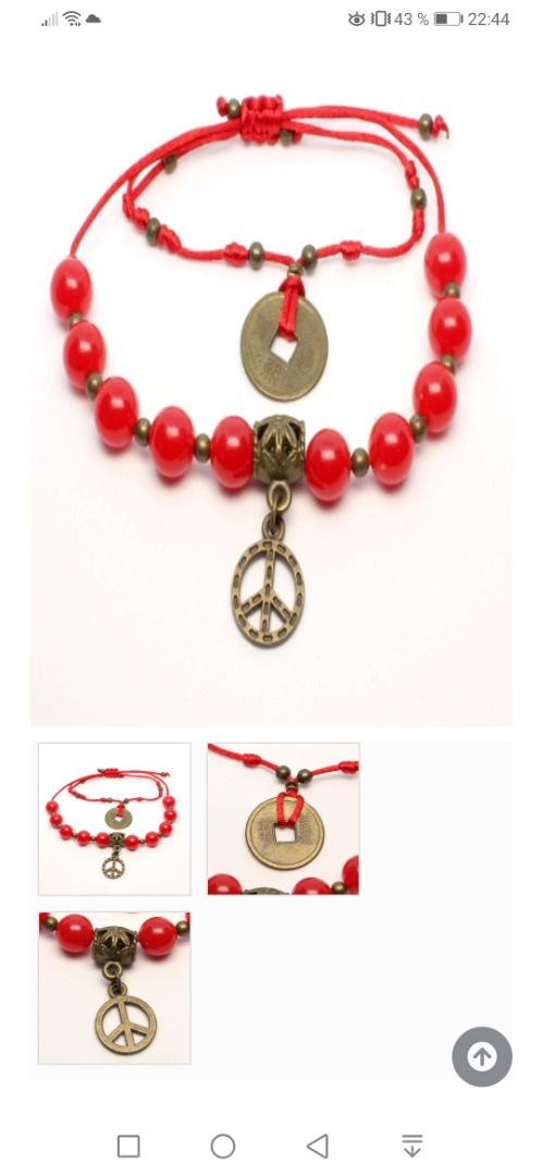
I have a problem with distorted images when viewing the website on mobile devices. When viewing a product and tapping a thumbnail, instead of changing the main image, an enlarged popup image is displayed. This image is distorted, in portrait mode the image is distorted in the vertical direction and conversely in landscape mode in the horizontal direction

Using firefox inspector I can see that the image ratio is generated by the system but I cannot identify the file responsible. This problem persists even when changing to the default joomla templates Beez and Protostar. I have also tried this on a new installation of joomla and hikashop, with no added modules or changes to any files with the same results.

I would like a single tap on a thumbnail to change the main image.
A double tap to enlarge the image and for the enlarged image to keep its aspect ratio in both portrait and landscape views.
Failing this I would like to disable the enlarged popup up for phones and tablets, but keep it for PC’s.

Attachments:

Please Log in or Create an account to join the conversation.

  • Posts: 83404
  • Thank you received: 13498
  • MODERATOR
6 years 1 month ago #303230

Hi,

Please try the different "image popup mode" choices available in the HikaShop configuration under the Display tab.

The following user(s) said Thank You: MalcolmB

Please Log in or Create an account to join the conversation.

  • Posts: 15
  • Thank you received: 0
6 years 1 month ago #303309

Hi Nicolas,

Have tried the various modes as suggested with the exception of Shadowbox (embedded) as I cannot find out how it is embedded. On JED the only extension called shadowbox, was updated 2015 and has links which give 404 errors.

Shadowbox (external) gives undistorted images, but its controls for the images on mobiles are so small and close together it is impossible to use accurately, which can lead to frustration. Also on mobile devices the popup is the only option as moving a finger across the thumbnails does not change the main image.

I had checked shadowbox previously and ruled it out as sometime the bottom of the image would off the bottom of the screen, would be unable to scroll the screen to get to the controls, so the back button at the top of the screen was the only way to leave the popup. Having checked this periodically during the day this problem would seem to no longer exist.

Will use the Shadowbox (embedded) for the time being, while I use JED to find a suitable alternative.

Please Log in or Create an account to join the conversation.

  • Posts: 83404
  • Thank you received: 13498
  • MODERATOR
6 years 1 month ago #303369

Hi,

If you want alternatives to the different image popup modes available by default, this plugin is available on our marketplace:
www.hikashop.com/marketplace/product/117...pups-by-obsidev.html
It includes three different additional image popup modes.

Regarding the "shadowbox embedded", it's basically when you add the js/css of shadowbox directly in your template as otherwise they come from our cdn server so that means that on the product pages of your website, your users' browser will download these files from our servers instead of yours. In some cases you might not want that. For example, if your users are in New Zealand, while our servers are located in France, using the embedded mode would help with the page load time.

Please Log in or Create an account to join the conversation.

  • Posts: 6
  • Thank you received: 2
4 years 1 month ago #328616

Hi I have a similar issue.
Only on mobile phones.

Everything is fine at our web ( www.arteaman.es ), but when you go to the product page ( arteaman.es/pulseras/delasuerte/pulsera-...justable-iching-roja ) first (principal) image appears stretched.
If you pick any other picture it's ok, the popup is ok, even the fist image loads fine if you click on it.
Do you have any idea?
I think it's because the image is stretched to screen wide, but not proportionaly, don't know how to check that.

Thanks in advance

Attachments:

Please Log in or Create an account to join the conversation.

  • Posts: 83404
  • Thank you received: 13498
  • MODERATOR
4 years 1 month ago #328632

Hi,

You have such CSS on your website to force the height of the image to be as tall as possible:
.hikashop_product_page .hk-row-fluid #hikashop_product_left_part .hikashop_product_main_image a img {
height: 100%;
width
But you don't have such CSS for the width. So that's why it's streched on mobile devices.
I don't know how that CSS is added to the page as you have an extension compliing the CSS on the page into a cache file (for performances I suppose).
I suppose a solution could be to add a similar CSS code for the width:
.hikashop_product_page .hk-row-fluid #hikashop_product_left_part .hikashop_product_main_image a img {
width: 100%;
}

Please Log in or Create an account to join the conversation.

  • Posts: 6
  • Thank you received: 2
4 years 1 month ago #328655

Thanks a lot Nicolas ¡¡
Will try to fix within this week and will report to you :)
thank you very much


CONFIRMED ¡¡¡ FIXED thank you very much Nicolas

Last edit: 4 years 1 month ago by luisolla.
The following user(s) said Thank You: Philip

Please Log in or Create an account to join the conversation.

Time to create page: 0.087 seconds
Powered by Kunena Forum