-- HikaShop version -- : HikaShop Starter 4.4.2
-- Joomla version -- : 3.9.27
-- PHP version -- : 7.4.3
-- Browser(s) name and version -- : Chrome Versión 90.0.4430.212 (Build oficial) (64 bits)
Hi,
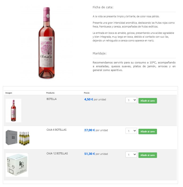
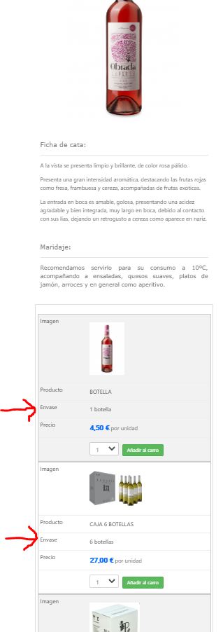
I want to hide characteristic column called "Envase" (see picture 1). Adding CSS .hikashop_product_characteristic, .hikashop_product_characteristic_3_row{ display: none;} at the end of my style_custom1.css file , it works for pc views and tablet view (see picture 2 and 3), but when I set navigator width view at less than 506 px (mobile view) , then the table get reordered in rows format instead columns and the column "Envase " that I want to hide, appears again (see picture 4).
How can i hide this column even in mobile view?
Thanks in advance,
Ricardo


 HIKASHOP ESSENTIAL 60€The basic version. With the main features for a little shop.
 HIKAMARKETAdd-on Create a multivendor platform. Enable many vendors on your website.
 HIKASERIALAdd-on Sale e-tickets, vouchers, gift certificates, serial numbers and more!
 MARKETPLACEPlugins, modules and other kinds of integrations for HikaShop

