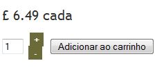
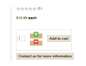
change + and - for add quantity to card

  • Posts: 7
  • Thank you received: 0
12 years 11 months ago #32212

I want to change the layout of the plus and minus button that are used to change the quantity of product to add to the card. I want to either remove the underline from the + and -, or change them into graphics.

In what file can I find the code? Can I create a template for this of my own?

I found that the code is generated from functions called in quantity.php, but got stuck from there.

Please Log in or Create an account to join the conversation.

  • Posts: 82819
  • Thank you received: 13366
  • MODERATOR
12 years 11 months ago #32252

You can do all that with CSS. No need to edit any code. You can look with firebug at the CSS we use on our demo website where we changed the style of the + and - links:

.hikashop_product_quantity_main .hikashop_product_stock td a {
color: #14CBEC;
font-weight: bold;
background: url(../images/add_white_dot.png) no-repeat center;
padding-left: 15px;
padding-right: 15px;
padding-top: 3px;
padding-bottom: 3px;
margin-top: 3px;
}

The following user(s) said Thank You: luizarios, lexiboy

Please Log in or Create an account to join the conversation.

  • Posts: 38
  • Thank you received: 0
12 years 3 months ago #59235

Hi,

Can you tell me how to remove the underline from under the + and - buttons?

Thank you,
Chris

Please Log in or Create an account to join the conversation.

  • Posts: 82819
  • Thank you received: 13366
  • MODERATOR
12 years 3 months ago #59288

You can add that CSS:

.hikashop_product_quantity_main .hikashop_product_stock td a, .hikashop_product_quantity_main .hikashop_product_stock td a:hover,.hikashop_product_quantity_main .hikashop_product_stock td a:visited{
text-decoration: none; }

Last edit: 12 years 3 months ago by nicolas.
The following user(s) said Thank You: luizarios

Please Log in or Create an account to join the conversation.

  • Posts: 38
  • Thank you received: 0
12 years 3 months ago #59346

nicolas wrote: You can add that CSS:

.hikashop_product_quantity_main .hikashop_product_stock td a, .hikashop_product_quantity_main .hikashop_product_stock td a;hover,.hikashop_product_quantity_main .hikashop_product_stock td a:visited{
text-decoration: none; }


Thank you very much, it worked. Although I did have to change the first ; to a :

Please Log in or Create an account to join the conversation.

  • Posts: 66
  • Thank you received: 0
12 years 3 months ago #60071

QuantumView wrote:

nicolas wrote: You can add that CSS:

.hikashop_product_quantity_main .hikashop_product_stock td a, .hikashop_product_quantity_main .hikashop_product_stock td a;hover,.hikashop_product_quantity_main .hikashop_product_stock td a:visited{
text-decoration: none; }


Thank you very much, it worked. Although I did have to change the first ; to a :


It worked for me and I did NOT have to change the ; to a, just copied and pasted Nicola's code and worked fine.

The only problem I see thou is that there is no space between the plus and minus


I tried to add a margin-bottom but it didn't work. I also tried to apply the margin-bottom to .hikashop_product_quantity_main .hikashop_product_stock .hikashop_product_quantity_field_change_plus td a{ but it didn't work :(

Attachments:

Please Log in or Create an account to join the conversation.

  • Posts: 82819
  • Thank you received: 13366
  • MODERATOR
12 years 3 months ago #60131

Try with that:
.hikashop_product_quantity_main .hikashop_product_stock td a, .hikashop_product_quantity_main .hikashop_product_stock td a:hover,.hikashop_product_quantity_main .hikashop_product_stock td a:visited{
padding: 5px; }

Please Log in or Create an account to join the conversation.

  • Posts: 15
  • Thank you received: 1
12 years 3 months ago #60136

Where in code does one change the minus to an mdash (emdash)? It's so small on the screen.

Please Log in or Create an account to join the conversation.

  • Posts: 82819
  • Thank you received: 13366
  • MODERATOR
12 years 3 months ago #60222

You can change the line:

<a id="hikashop_product_quantity_field_change_minus_'.$i.'" class="hikashop_product_quantity_field_change_minus hikashop_product_quantity_field_change" href="#" onclick="return hikashopQuantityChange(\'hikashop_product_quantity_field_'.$i.'\',0,'.$max_quantity.','.$min_quantity.');">-</a>


to:

<a id="hikashop_product_quantity_field_change_minus_'.$i.'" class="hikashop_product_quantity_field_change_minus hikashop_product_quantity_field_change" href="#" onclick="return hikashopQuantityChange(\'hikashop_product_quantity_field_'.$i.'\',0,'.$max_quantity.','.$min_quantity.');">—</a>

in the file administrator/components/com_hikashop/helper/cart.php

Please Log in or Create an account to join the conversation.

  • Posts: 15
  • Thank you received: 1
12 years 3 months ago #60520

That worked well but now I'm forgetting where to turn down the style... where does one remove the block of color in style sheet? What am I looking for (besides my brain peanut gallery)...


Attachments:

Please Log in or Create an account to join the conversation.

  • Posts: 82819
  • Thank you received: 13366
  • MODERATOR
12 years 3 months ago #60597

Can you give a link to that page ?

Please Log in or Create an account to join the conversation.

Time to create page: 0.116 seconds
Powered by Kunena Forum