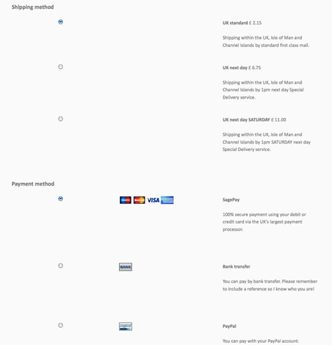
I'd like to tighten up the spacing on my checkout page and put the sections (shipping, payment, address etc) in separate boxes or borders, like the HS demo site checkout page. Where do I set this up please? Is it within Hikashop configuration, Hikashop CSS or is it my site template? And what do I need to change? I've attached a snapshot of how it looks now.
Also, the popup box that says item successfully added to cart/proceed to checkout is in the wrong font (a default Times font?) rather than the font used by my template like the rest of the site. Where can I change the styling of these popup boxes please?
Thanks.
 HIKASHOP ESSENTIAL 60€The basic version. With the main features for a little shop.
 HIKAMARKETAdd-on Create a multivendor platform. Enable many vendors on your website.
 HIKASERIALAdd-on Sale e-tickets, vouchers, gift certificates, serial numbers and more!
 MARKETPLACEPlugins, modules and other kinds of integrations for HikaShop


