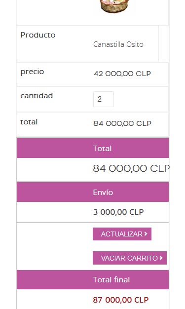
i found something better and get the table to be responsive with no problems.
i describe it:
you have to modify cart view in checkout
add a div before the table id="no-more-tables"
add class empty to all <td></td>
add data-title to the td you want to display with title.
finally add this css
@media only screen and (max-width: 767px) {
/* Force table to not be like tables anymore */
#no-more-tables table,
#no-more-tables thead,
#no-more-tables tbody,
#no-more-tables th,
#no-more-tables td,
#no-more-tables tr {
display: block;
}
/* Hide table headers (but not display: none;, for accessibility) */
#no-more-tables thead tr {
position: absolute;
top: -9999px;
left: -9999px;
}
#no-more-tables tr { border: 1px solid #ccc; }
#no-more-tables td {
/* Behave like a "row" */
border: none;
border-bottom: 1px solid #eee;
position: relative;
padding-left: 50%;
white-space: normal;
text-align:left;
}
#no-more-tables td:before {
/* Now like a table header */
position: absolute;
/* Top/left values mimic padding */
top: 6px;
left: 6px;
width: 45%;
padding-right: 10px;
white-space: nowrap;
text-align:left;
font-weight: bold;
}
/*
Label the data
*/
#no-more-tables td:before { content: attr(data-title); }
.empty {display:none !important;}
that´s how it finally shows

 HIKASHOP ESSENTIAL 60€The basic version. With the main features for a little shop.
 HIKAMARKETAdd-on Create a multivendor platform. Enable many vendors on your website.
 HIKASERIALAdd-on Sale e-tickets, vouchers, gift certificates, serial numbers and more!
 MARKETPLACEPlugins, modules and other kinds of integrations for HikaShop


