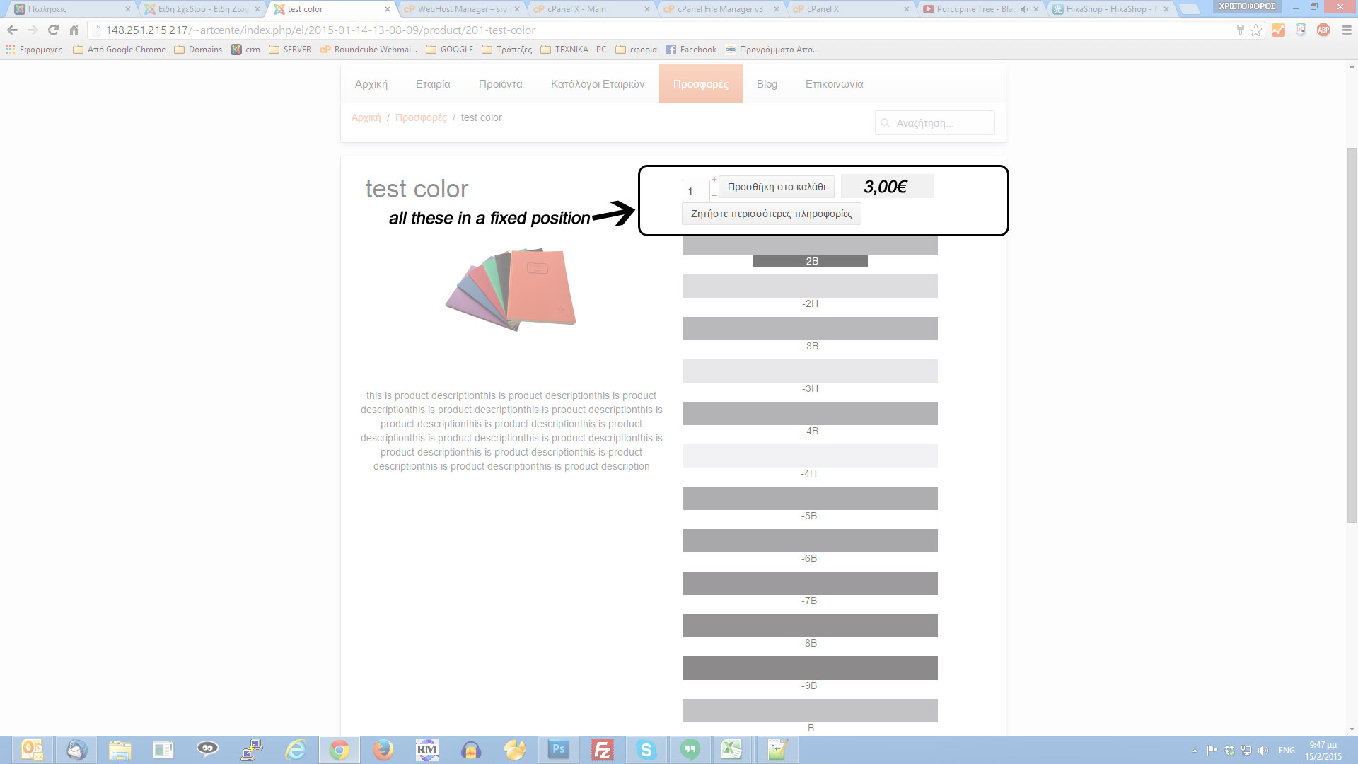
Move add to cart button on top and scroll

  • Posts: 1053
  • Thank you received: 11
  • Hikashop Business
9 years 8 months ago #190809

-- HikaShop version -- : 2.3.5
-- Joomla version -- : 3.3.6

Hi!
I m trying some days now to change the product layout of this page

Part of the message is hidden for the guests. Please log in or register to see it.

What I need to do, because I ll have many colors, is to make a div and include in it, the add to cart button and the price. So when the visitor scrolls it will follow.
ex:

position: fixed;
top: 63%;
left: 0;
margin-left: 0;
width: 169px;
It s a useful addition I believe.

I found in show_default.php some tricks and changed a little bit the layout. But when I m trying to move code that included the "add to cart button" I get a blank page.
In the screenshot I draw the desired result.
It would be more than perfect if there is an if that start scrolling the whole div after the div is disapeared from the screen.

Thanks in advance!

Attachments:

Please Log in or Create an account to join the conversation.

  • Posts: 82726
  • Thank you received: 13341
  • MODERATOR
9 years 8 months ago #190822

Hi,

The code for the add to cart button is:

<div id="hikashop_product_quantity_main" class="hikashop_product_quantity_main">
			<?php
			//LAYOUT quantity
			$this->row = & $this->element;
			$this->ajax = 'if(hikashopCheckChangeForm(\'item\',\'hikashop_product_form\')){ return hikashopModifyQuantity(\'' . $this->row->product_id . '\',field,1' . $form . ',\'cart\'); } else { return false; }';
			$this->setLayout('quantity');
			echo $this->loadTemplate();
			?>
		</div>
Move it before the code:
<span id="hikashop_product_price_main" class="hikashop_product_price_main">
if you want it before the price.

Please Log in or Create an account to join the conversation.

  • Posts: 2
  • Thank you received: 0
9 years 8 months ago #191579

Joomla 3.3.6
Hikashop 2.3.5
Hi everybody,
Nicolas could you please help with solving few issues:
1) What and where I have to do to put "add to wish list' near "add to cart" on product div and on the product page?
2) How can I enlarge only main image on the product page?
3) How can I add compare button/checkbox? Compare option is enabled in the cofiguration, and there are inherit option on all views

Thanks in advance

Attachments:

Please Log in or Create an account to join the conversation.

  • Posts: 82726
  • Thank you received: 13341
  • MODERATOR
9 years 8 months ago #191583

Hi,

1. and 2. These are customized by your template CSS/view overrides on your screenshot. The best would be to ask your template provider. I can have a look but in that case I would need to look at your page's HTML/CSS on your website (so I would need a link to these pages).

3. Just turning on the option in the configuration should be enough. It it doesn't display anything, it could also be an issue with your template overriding the views of the products listings. Switch your Joomla template to the default one and see if that helps. If yes, then the issue is with the view overrides in your template. The best would be to contact your template developer so that they can tell you what to do exactly.

Please Log in or Create an account to join the conversation.

  • Posts: 2
  • Thank you received: 0
9 years 8 months ago #191647

Thanks for reply,
Unfortunately website on my local server currently.
I switched template to joomla standard(beez3) but add to cart and wishlist buttons still on two different rows.
I opened my website in inspection mode in Firefox browser and I saw add to cart and add to wishlist in 2 different divs(see ins1.jpg)
I cut code from add to wishlist div and paste it to div class=hikashop_product_stock before add to card button code

<a rel="nofollow" class="hikashop_cart_button" href="#" onclick="var field=document.getElementById('hikashop_product_quantity_field_1');if(hikashopCheckChangeForm('item',0)){ return hikashopModifyQuantity('1',field,1,0,'wishlist',126); } else { return false; }"><img src="http://lavochka/images/lavochka/icons/wishlist.png" style="float:rightstyle=padding-bottom:-40px" align="middle"></a>
And I have got 2 buttons on one line (see ins2.jpg)
One more comment, if I turn on the quantity option on the product, I see the quantity field on the place where I want to place add to wishlist button. I thought it might be helpful...

As you see, you was right on item 3. When I switched template to joomla standard (beez3) - I have got the compare button.

Attachments:
Last edit: 9 years 8 months ago by sergey.mikhailenko.

Please Log in or Create an account to join the conversation.

  • Posts: 82726
  • Thank you received: 13341
  • MODERATOR
9 years 8 months ago #191653

Hi,

The switching of the template was for the compare button. So as you say that it works with the default template, then it's a view override in the template which causes the issue.

For the buttons, they are on two lines by default yes, but by default they don't look like this. So they are styled by your template. By default they look like a normal browser button: take.ms/QdaIt
So I would really need to look at the page to tell you exactly what CSS should be used.
I guess that the simplest will be to change the divs float property to inline so that they can display one next to the other.

Please Log in or Create an account to join the conversation.

Time to create page: 0.092 seconds
Powered by Kunena Forum